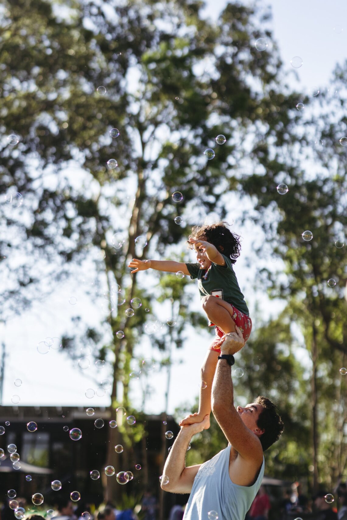
The rebrand
The 2024 rebrand was about more than just aesthetics. It was a strategic evolution.
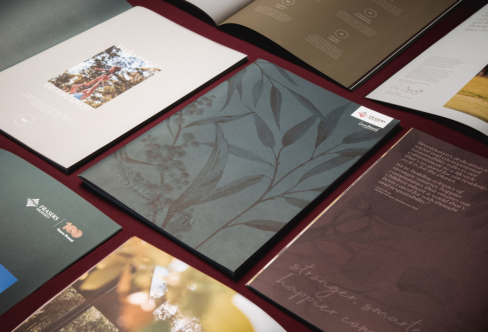
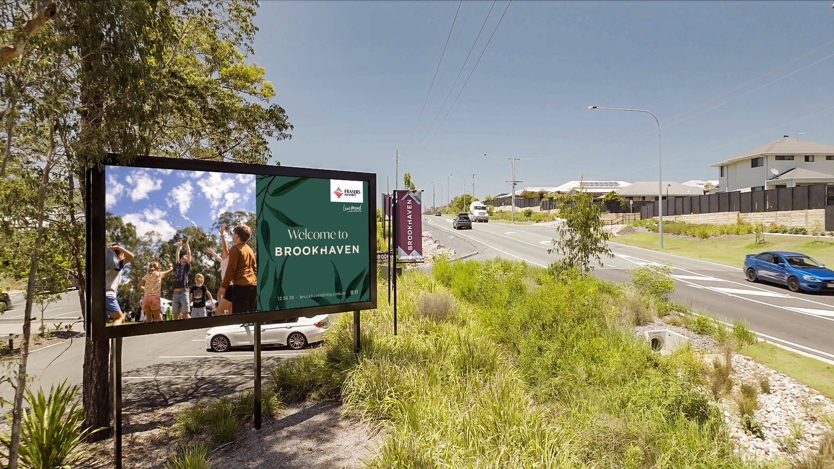
Our refreshed identity keeps recognisable elements like the logo and tagline to preserve trust and continuity, but now better reflects the maturing community.
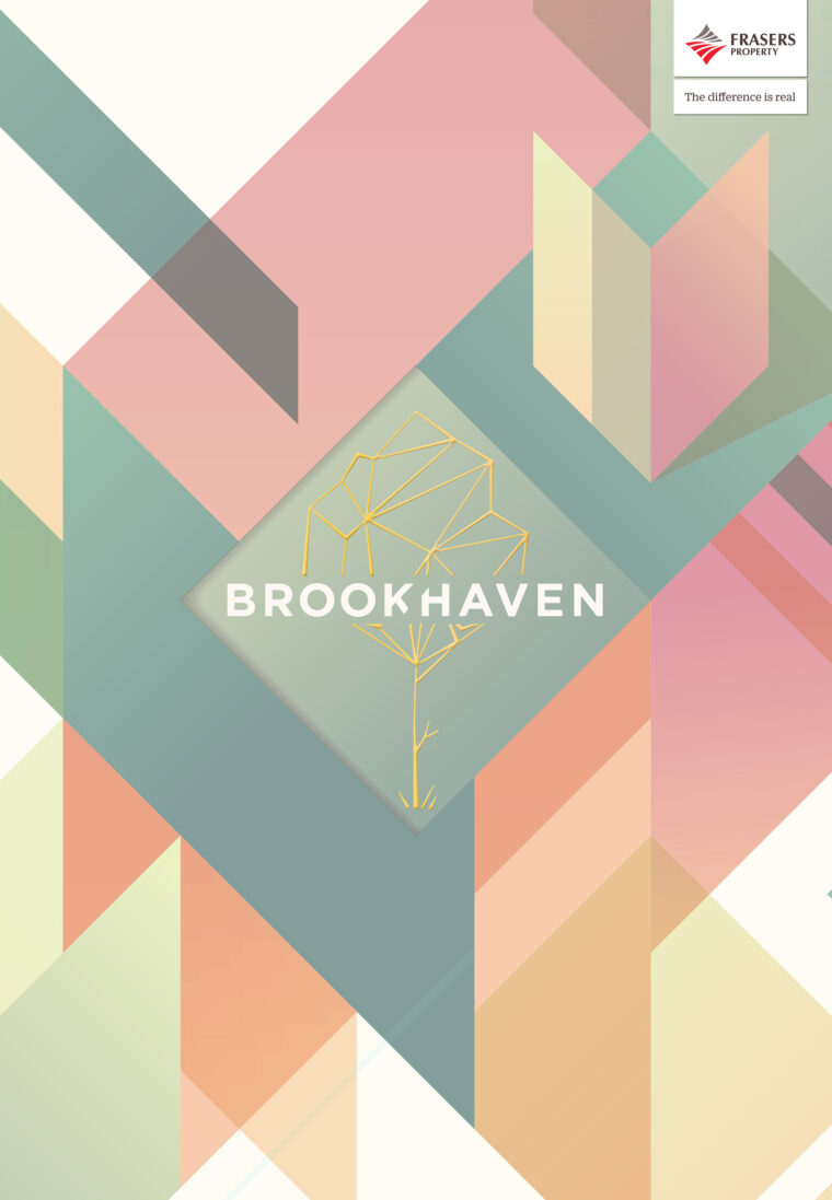
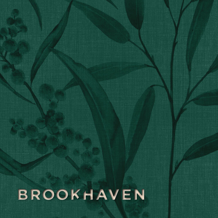
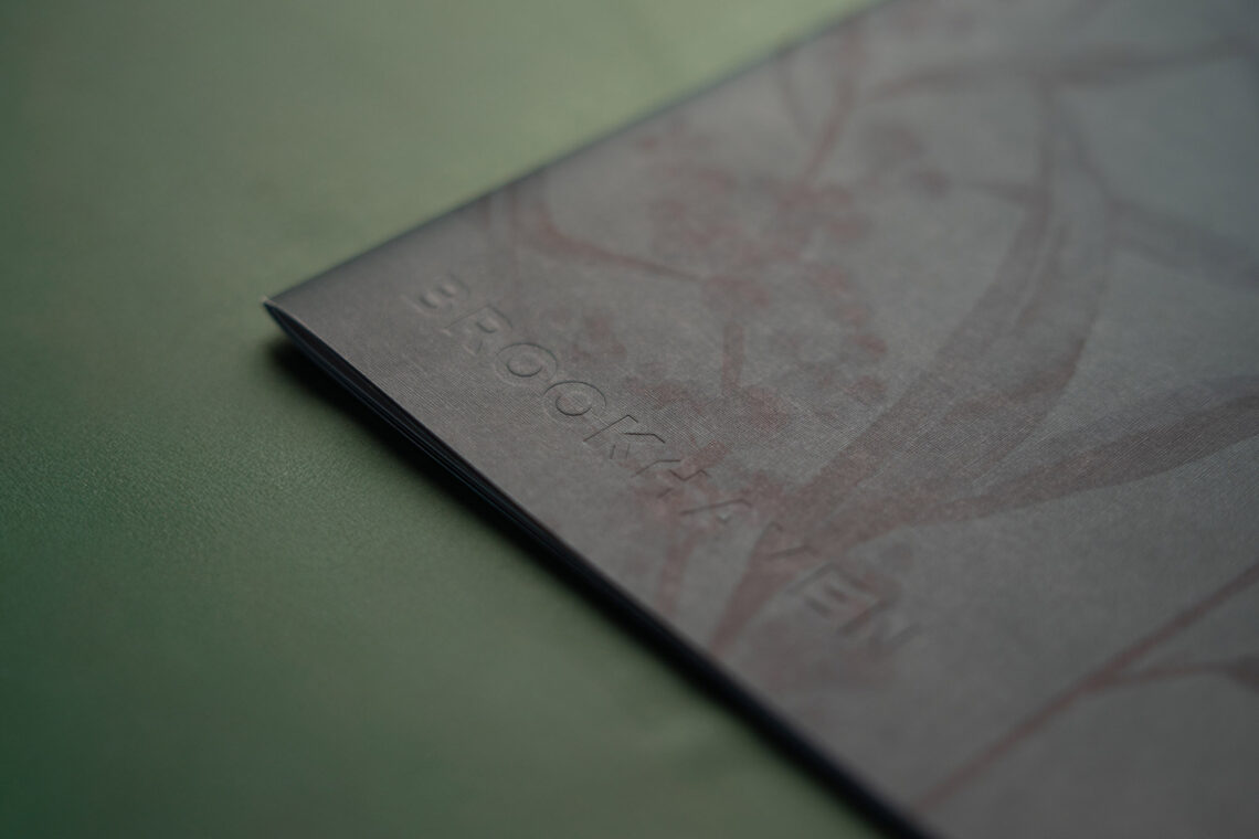
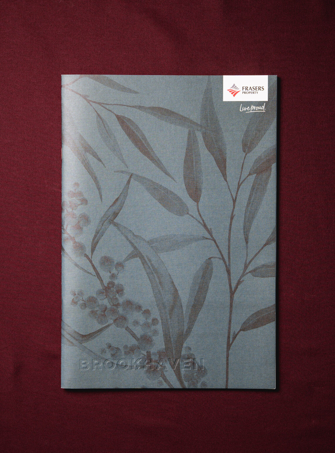
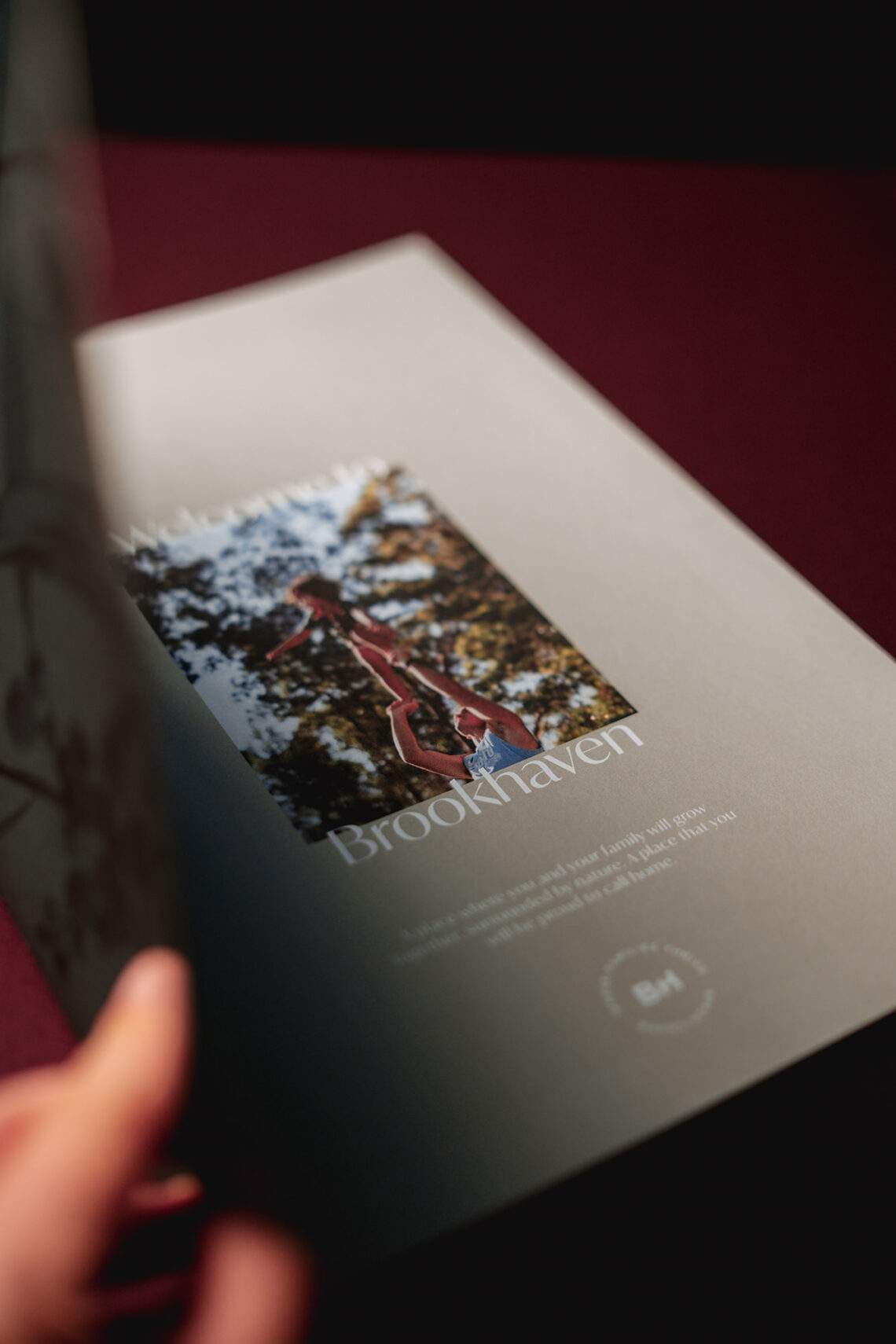
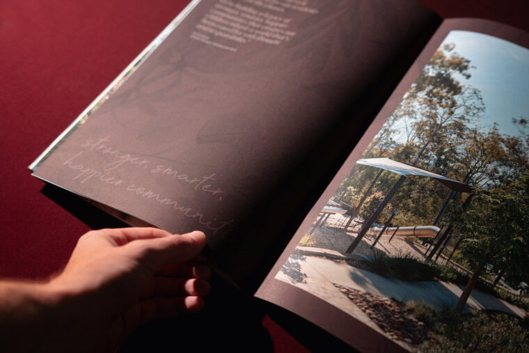

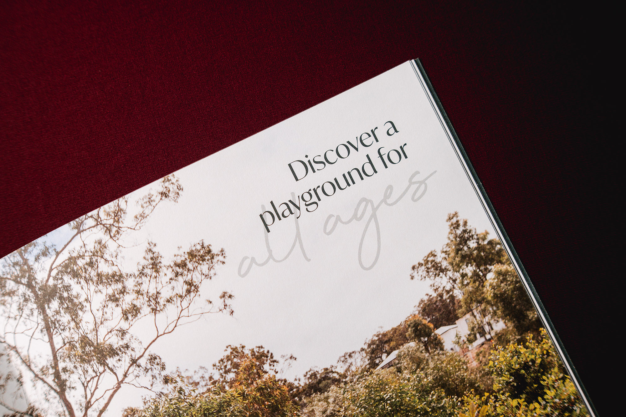
The Gotham typeface is overused, so we replaced it with one featuring diamond-shaped punctuation, pronounced contrast and bias-cut extenders. These details introduce a crispness and energy that echo Brookhaven’s fresh, leafy surrounds.
Our subtle but impactful changes modernise the Brookhaven brand while keeping it grounded.
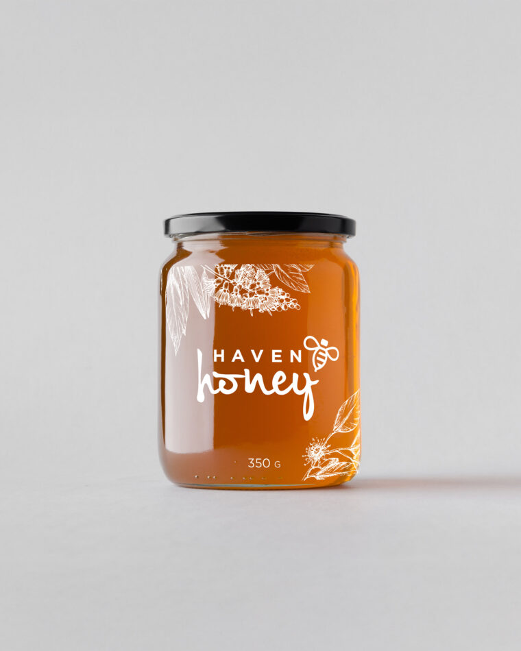

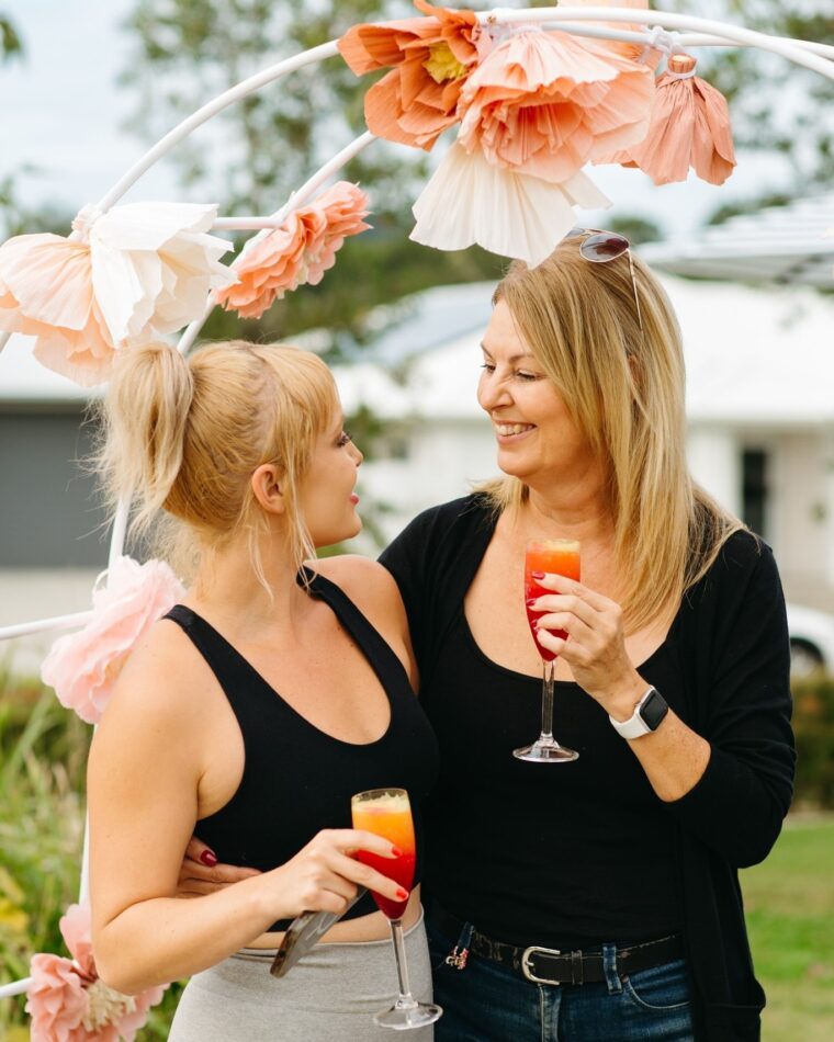
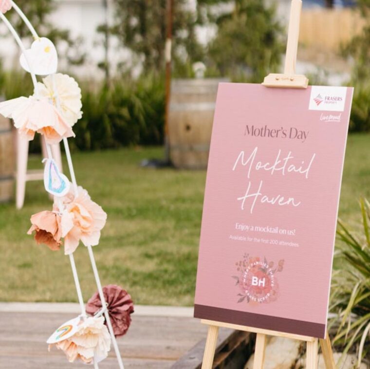
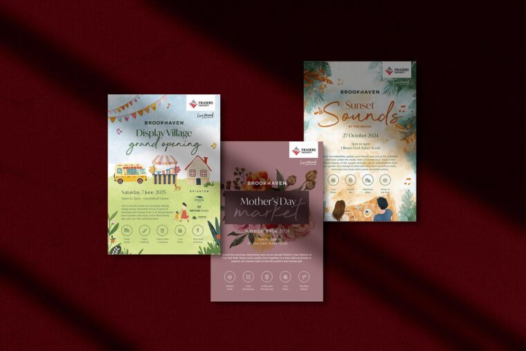
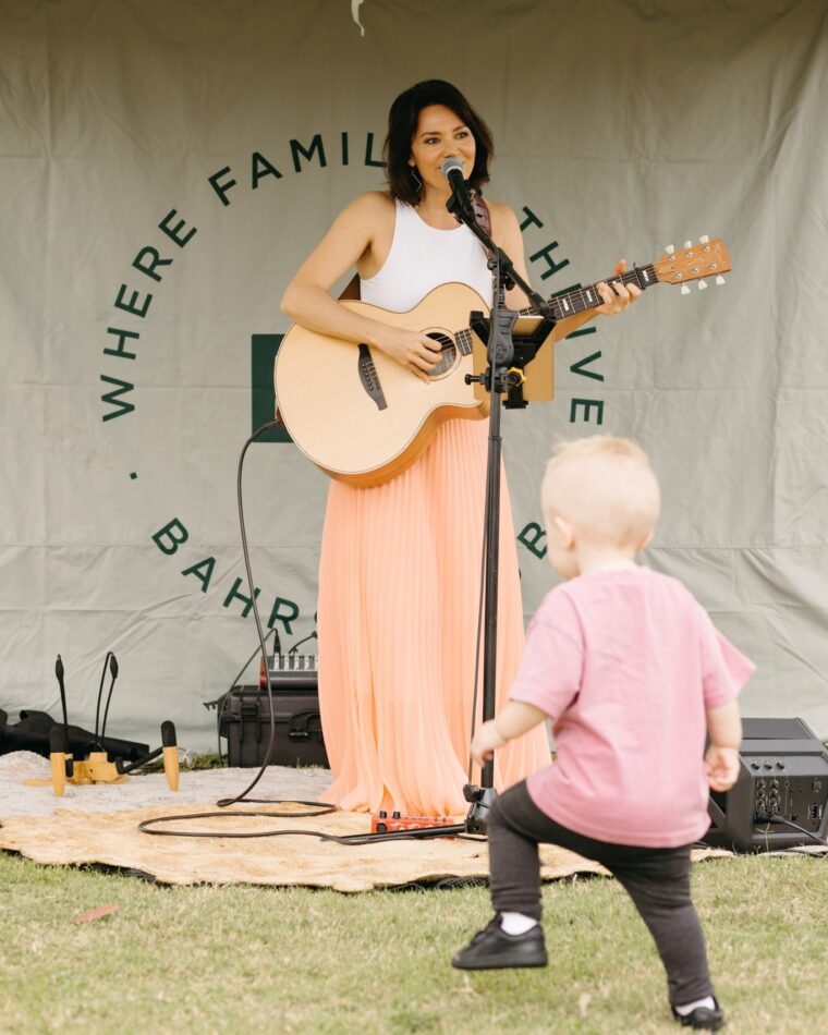
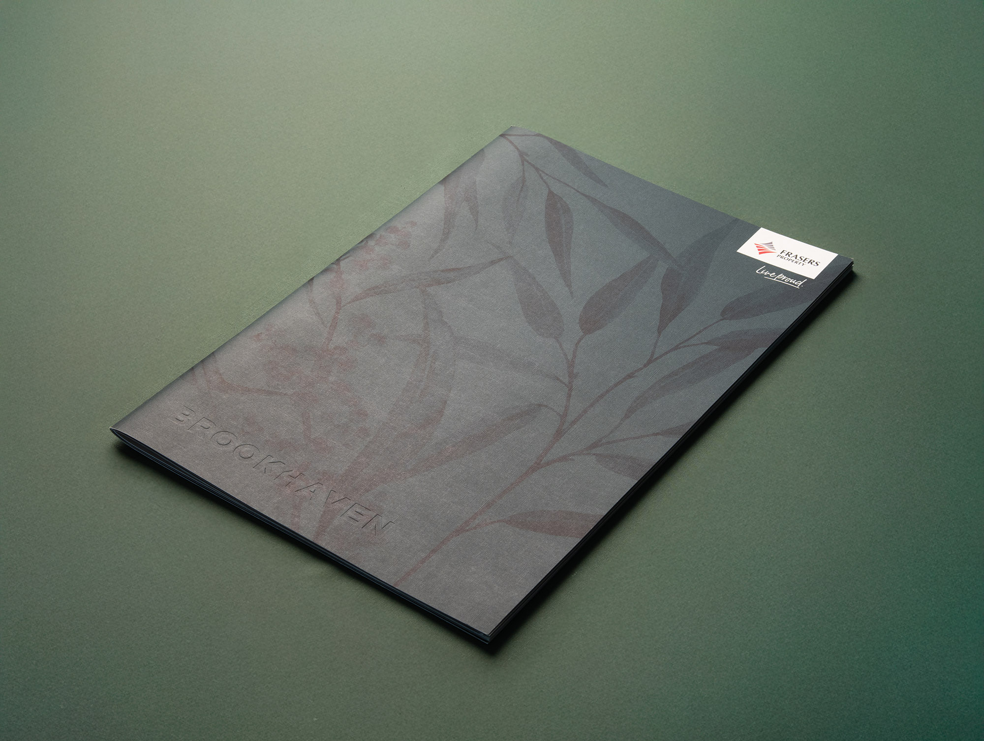
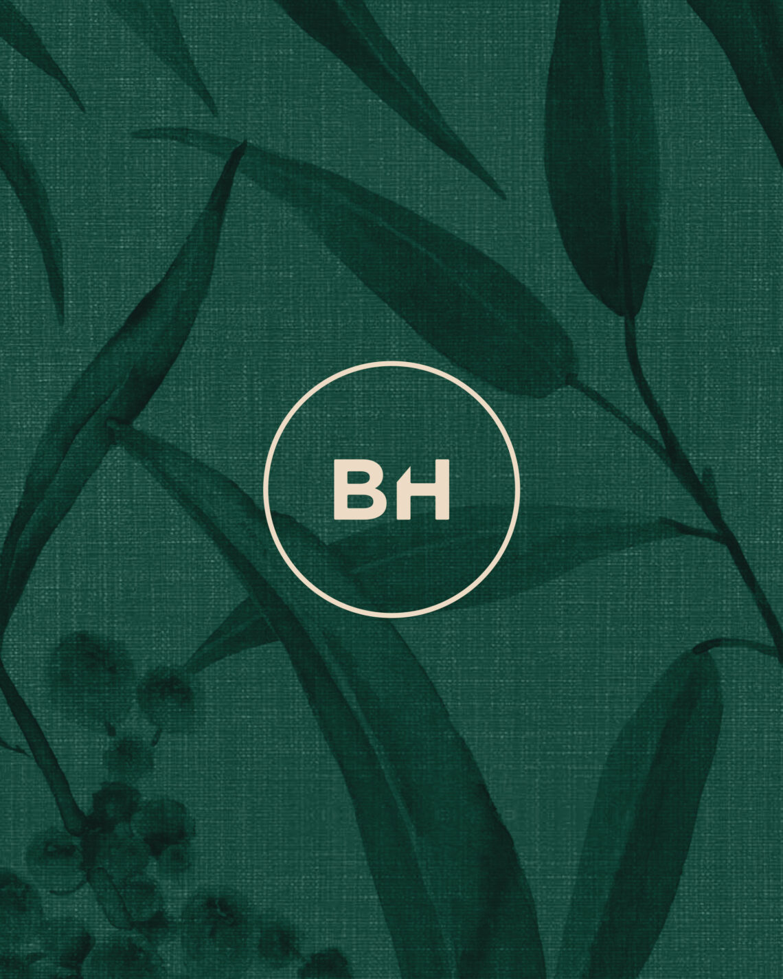
Inspired by the lush greens of Brookhaven infused with twilight hues from the Dulux forecast, the updated colour palette adds depth, organic texture and sophistication, while watercolour illustrations of native flora bring a warm, local touch.
Since partnering with Frasers Property in 2017, our ongoing strategy and creative execution have helped Brookhaven become one of Queensland’s most in-demand masterplanned communities.
Brookhaven is now ranked #3 in Queensland’s Top 10 Most Enquired Housing Developments (Q1 2025)
(source: openlot, Top 10 Most Enquired Housing Developments in Qld – Q1 2025)
This milestone is a testament to the power of long-term brand thinking and strategic creativity in action.
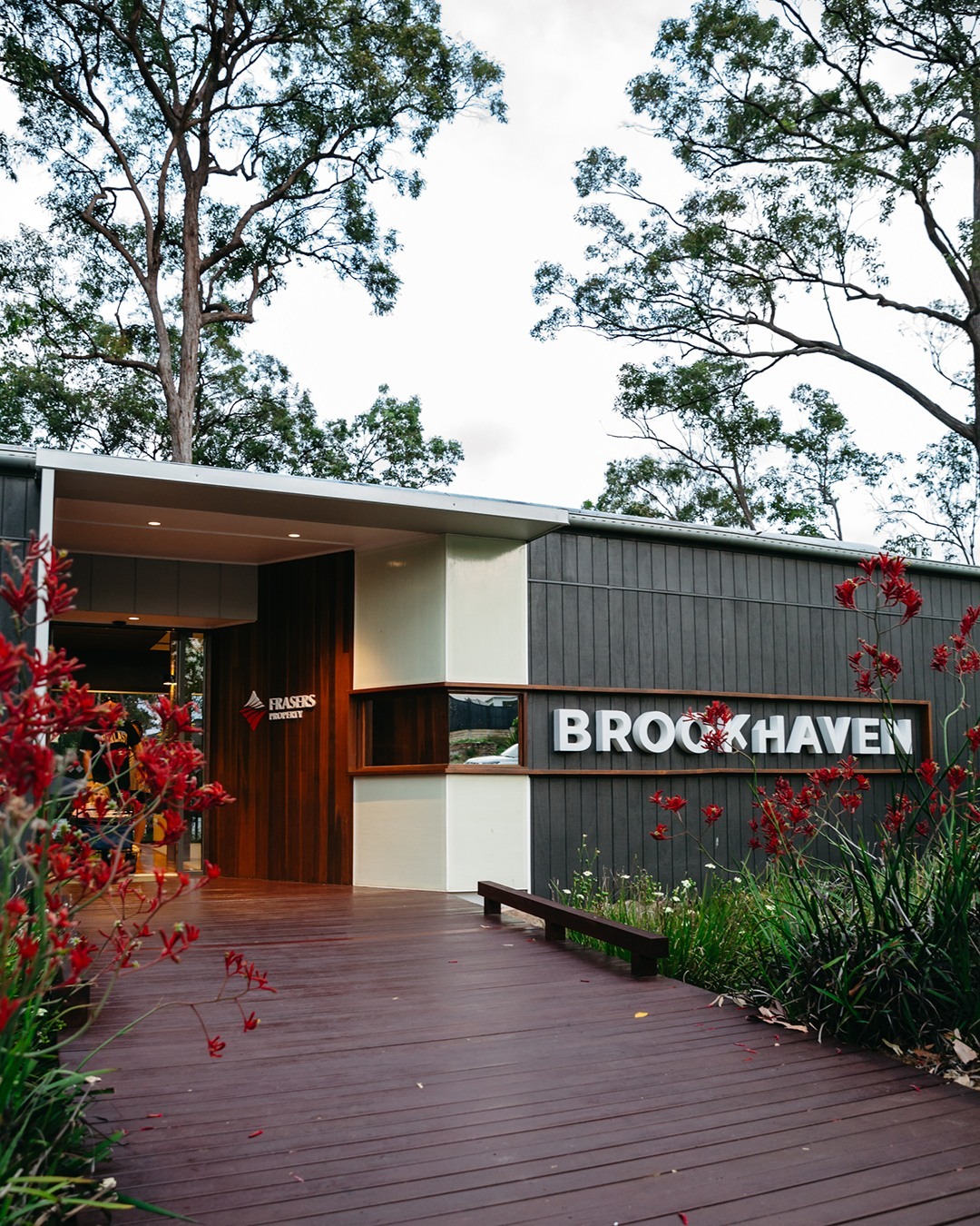
Brookhaven shows what’s possible when brand, place and purpose align.
For developers and marketing teams, it’s a reminder that branding is more than just launch-day polish. It’s an enduring asset that grows value, drives buyer engagement and supports every stage of a project’s lifecycle.
