Design and delivery
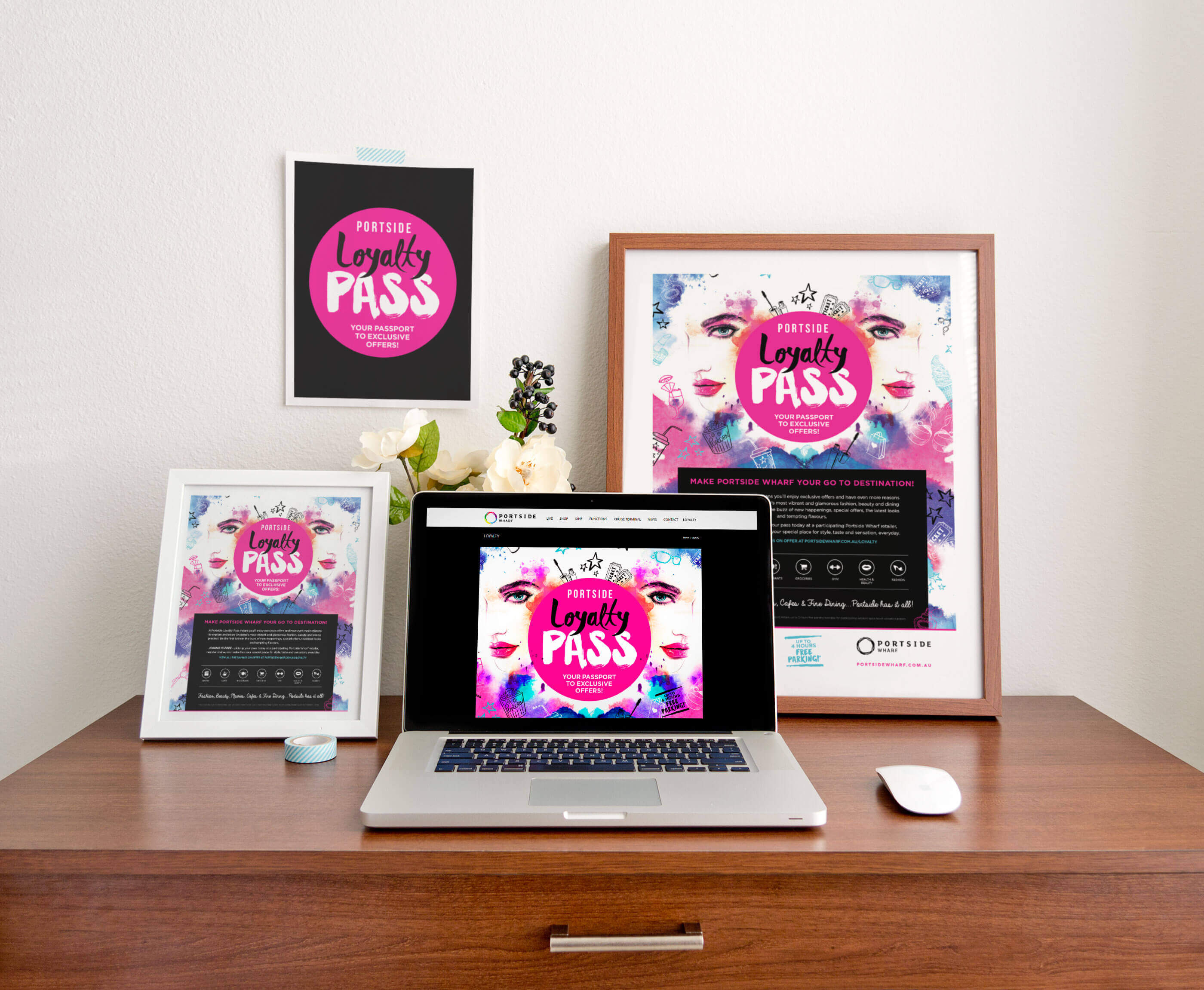
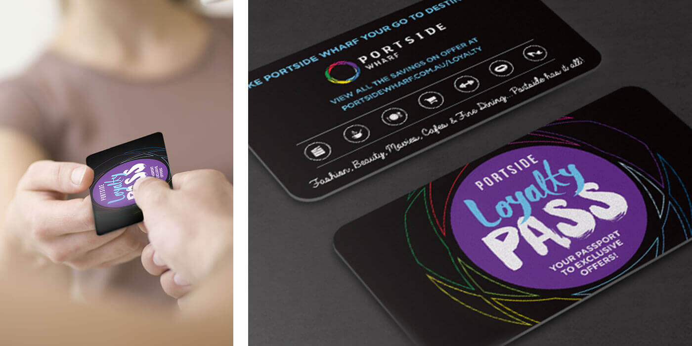
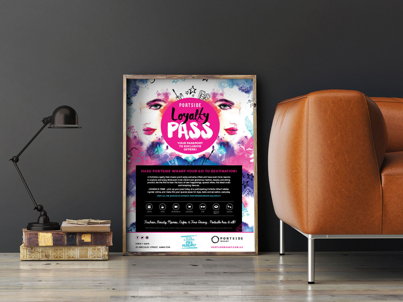
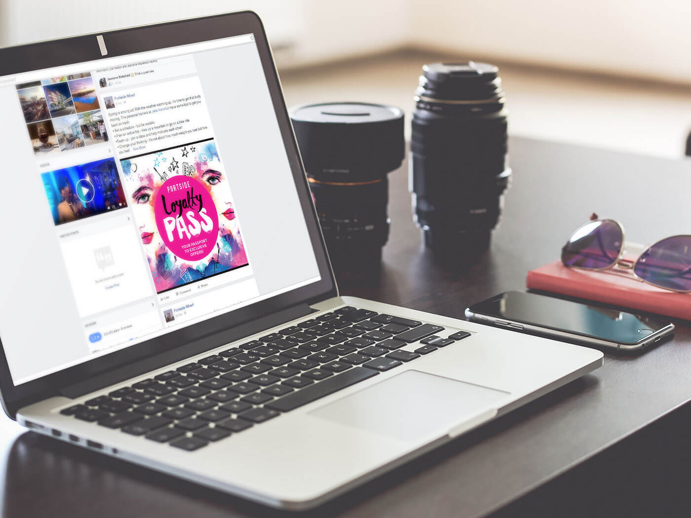
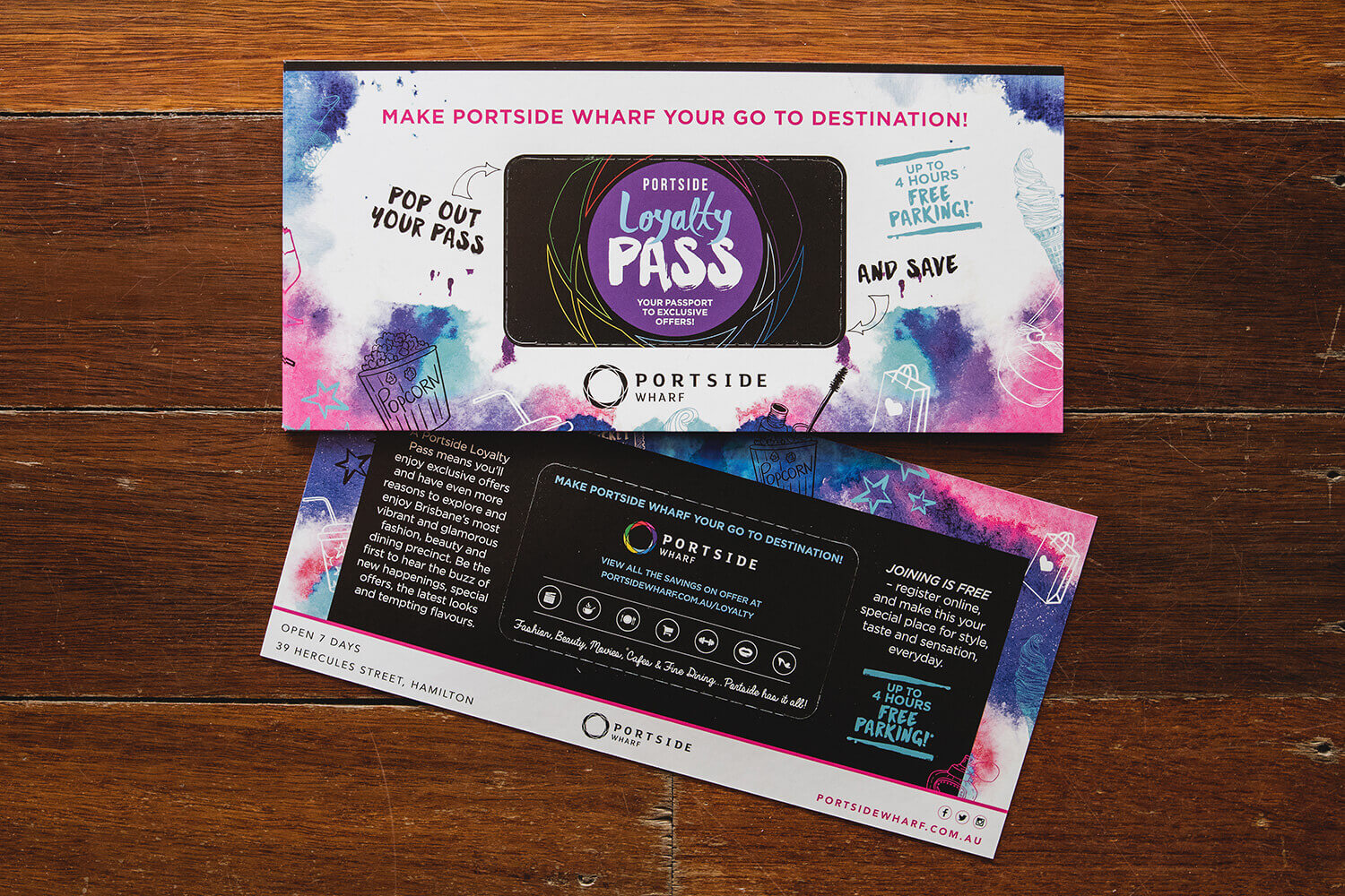
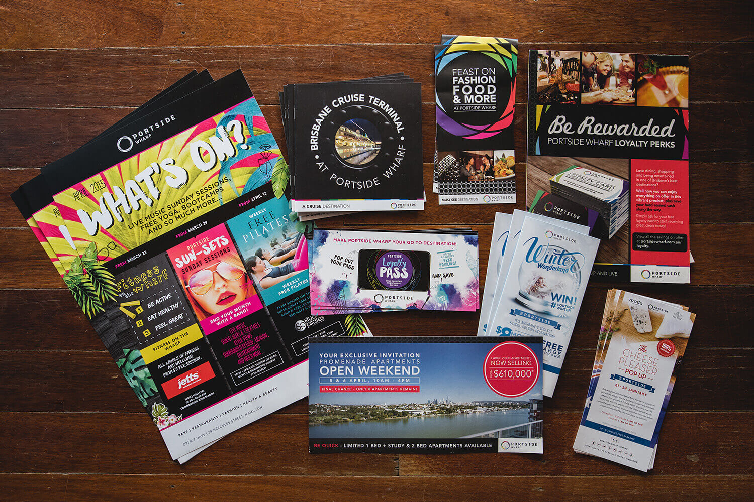
The creative products comprised both digital media elements for the Portside website and electronic direct mail, and print collateral across posters and flyers.
The use of a dynamic and artistic watercolour and pen-and-ink effect gives an edge to the branding that stands apart from most other campaigns in the genre. It is glamorous, evocative and absolutely upmarket, and the watercolour effect has a resonance with the riverside location and the colours and shifting patterns of light and reflections on the water, while the icons in pen-and-ink style suggest the rewards Loyalty Members can expect.
This artistic emphasis was also designed to appeal strongly to the demographic the precinct aims to attract to its retail, hospitality, entertainment and accommodation offerings.
The copy had an overall emphasis on Portside as Brisbane’s premier “go to destination” – somewhere vibrant, multi-faceted and enticing to explore and enjoy.
User experience
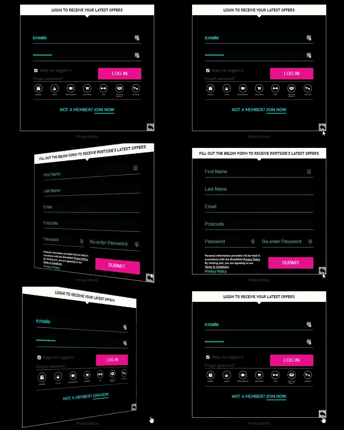
In building the website, our developer added some functionality that makes for both a compelling and satisfying user experience. Users sign up for a Loyalty Pass by filling out an on-line form. Once this is done, they are immediately logged in with no wait time, and can immediately view the deal that interests them.
There is also a dynamic “flip” effect users see on the Loyalty page if they are not logged in, which uses animation to flip between the Sign Up and Log in forms. This provides a stimulus to users to sign up so they can log in. It also makes log-in easy and obvious for members.
The deals on offer are presented in categories at the website in a grid format, with the ability to tab between them. This enables simple navigation between types of rewards and also emphasises the wide range of them.
This is turn feeds back into the overall branding of the precinct as a special destination that offers a multitude of options including beauty, food and beverages, retail, boutiques, fitness, Dendy Cinema, events and accommodation.
OTHER CREATIVE

