Print, signage or digital. How you intend to use your brand colours will impact the best colour space for the job. For example, it is best not to use PMS colours on a website, just like it is best not to use RGB colours on a printing press.
At iCreate, we provide a style guide as part of our branding projects. This guide will contain loads of information on how to maintain a beautiful brand, including the four colour values – PMS, CMYK, RGB and HEX.
As a simple and quick guide; for on-screen designs use RGB or HEX; and for printing use CMYK or Pantone.
Onscreen design
RGB (Red, Green, Blue)
Use: On-screen
RGB refers to a system for representing the colours of red, green and blue light for displaying a colour on-screen.
As a general rule of thumb, use RGB digitally such as websites, pdf for viewing on-screen and social media.
Hex (Hexadecimal)
Use: Onscreen
Designers and developers use HEX colours in web design. A HEX colour is as a six-digit combination of numbers and letters defined by its mix of red, green and blue (RGB).
Printing
PMS (Pantone® Matching System)
Use: Printing
Often used in one or two-colour jobs. Also used as spot colours on premium brochures in addition to a four colour (CMYK) process.
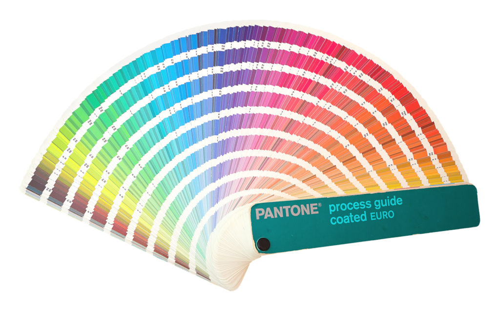
PMS colours (also called Pantone® colours) are patented, standardised colour inks made by the Pantone company.
Your iCreate designer has referred to the Pantone colour swatches to carefully select your brand colours. When your project goes to print, the printer will refer to the same set of swatches. This will ensure everyone is working to the same PMS colour no matter where they are in the world, which guarantees the same colour will be printed.
For printers to retain their license, they must annually submit samples of the 18 basic colours for approval by Pantone.

CMYK (Cyan, Magenta, Yellow, Black)
Use: Printing
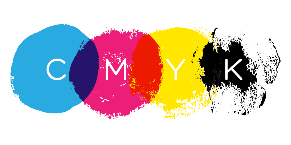
The most common method of achieving colour in printing is with CMYK. (Also referred to as four colour process / process) and is used in the majority of printed materials from brochures, flyers and signage and more. To reproduce a colour image, a file is separated into four different colours: Cyan (C), Magenta (M), Yellow (Y) and Black (K).

Where a Pantone ink is one solid colour throughout, CMYK is different. When you look through a magnifying glass, you can see tiny transparent dots of the four ink colours, plus a combination of small and large dots all mixed together to create full colour images. This composite image fools the naked eye with the illusion of continuous tone.

When selecting brand colours using the CMYK colour system, iCreate designers always refer to our printed Pantone Colour Bridge Guides which provides us with the closest industry-standard CMYK equivalent when process printing is required. This allows us to visualise how the colour will look when printed on a standard coated or uncoated stock.
For more information: https://www.pantone.com/colorintelligence/articles/technical/spot-vs-process-color
IMPORTANT – Colour on screens and printed material – what you need to know!
An often overlooked and misunderstood part of the process is the issue of approving colour on screen.
At iCreate we have calibrated monitors to ensure colour accuracy, but your screen will not be, which makes it hard for you to know how the colour will actually look once printed! To add another important element into the mix, the final material you print on can also change the colour. How a colour looks on uncoated paper – to gloss paper – to vinyl and mesh for signs can all be different!
Therefore, we recommend that you send your brand colour samples to a printer and signwriter before settling on the final colours. And be sure to keep your samples on file so you can refer to it down the track too.
Key takeaways
- Use the appropriate colour system for the right output
- Don’t convert an RGB colour straight to a CMYK – this will result in unexpected results. Please use the value provided in your style guide.
Ultimately, colour can be a little tricky. If at any stage in the process you are unsure – please be sure to reach out to us. We would be more than happy to guide you through the right approach so you achieve the best outcome.
Looking for help getting your brand colours just right? Contact iCreate to get a new brand or brand refresh underway >

