Nobelle Group engaged us to shape the brand vision for Lumière—a boutique coastal address that redefines refined living in Redcliffe.
Challenge
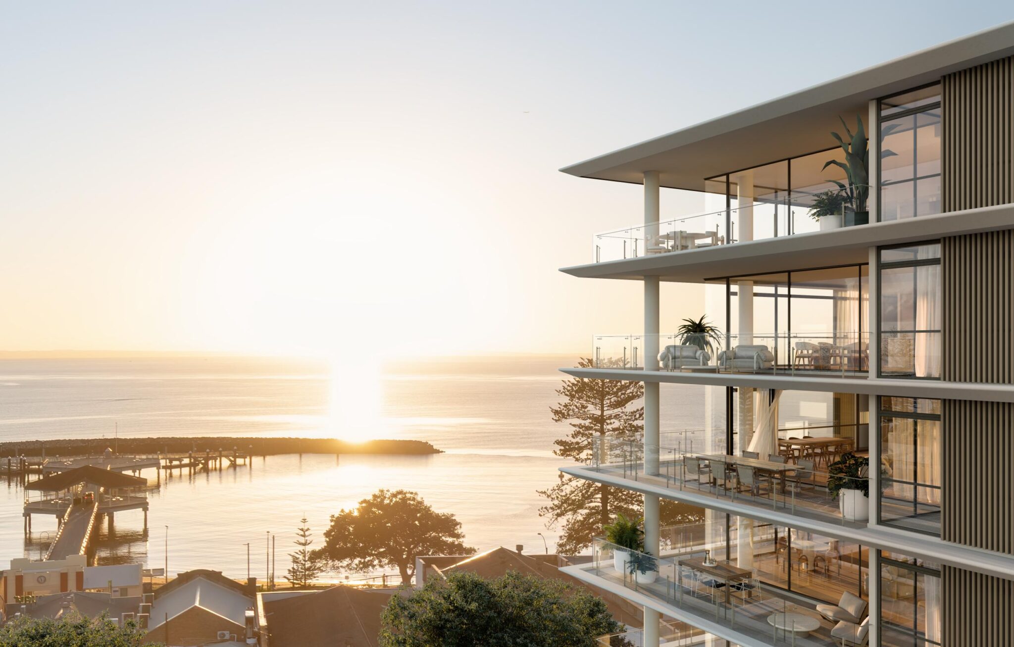
Working from a single logo, we developed the full brand story, positioning and creative direction to capture the project’s essence of understated luxury, architectural integrity and the luminous ease of coastal life. The challenge lay in transforming a modest visual starting point into a complete, high-end brand that could stand alongside Queensland’s leading coastal developments.
Nobelle Group needed clarity, strategy and storytelling that would elevate Lumière beyond the typical beachside apartment narrative. Our task was to distil the sophistication of the architecture and the effortless calm of coastal living into a cohesive identity that would inspire confidence, attract discerning buyers and establish Nobelle Group as a visionary developer in the region.
Strategy and Approach
Our strategy centred on the name Lumière—French for ‘light’—and the quiet elegance it evokes. Inspired by Redcliffe’s soft coastal sunrises, we built a brand around the ideas of reflection, tranquillity and glow, capturing not only the clarity of light but the warmth it creates.
This concept extended beyond visuals into language, infusing the brand with chic expressions and quotes from icons such as Coco Chanel and Yves Saint Laurent. These references elevated the brand’s tone, reinforcing Lumière as a symbol of effortless elegance and timeless style.
Every touchpoint was designed to feel luminous and refined for a brand that embodies coastal luxury.
Final Experience
Every element works cohesively to express Lumière’s essence of understated coastal luxury. It was a complete brand experience built from the ground up, unified by a single, luminous idea.
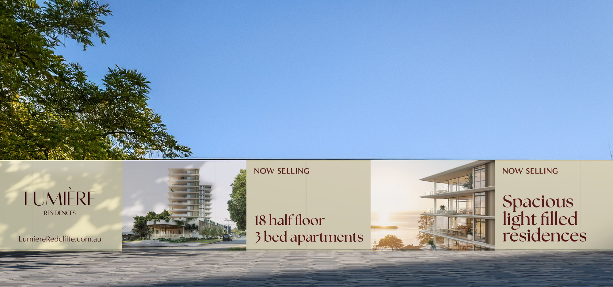
And it worked. Within a week of the hoarding going up, Lumière generated qualified leads without listings, ads or social media. The design, messaging and strategic placement alone drove engagement, with QR tracking confirming that significant enquiries were coming from the hoarding.
For Nobelle Group, it demonstrated the power of brand-led marketing. For us, it was proof that when strategy and creativity align, results follow.
Through a messaging workshop with Nobelle Group, we uncovered the essence of Lumière. Drawing inspiration from its name, we wove in common French phrases, like ‘Je ne sais quoi’ and ‘La crème de la crème’, and quotes from design icons to elevate the tone, creating a narrative that felt sophisticated, effortless and distinctly Lumière.
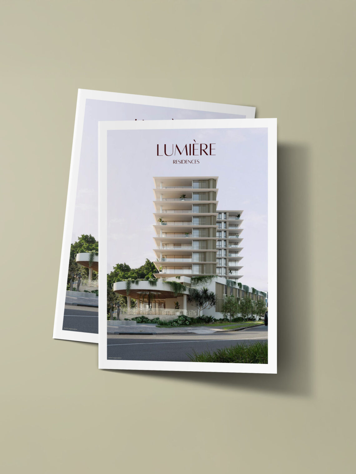
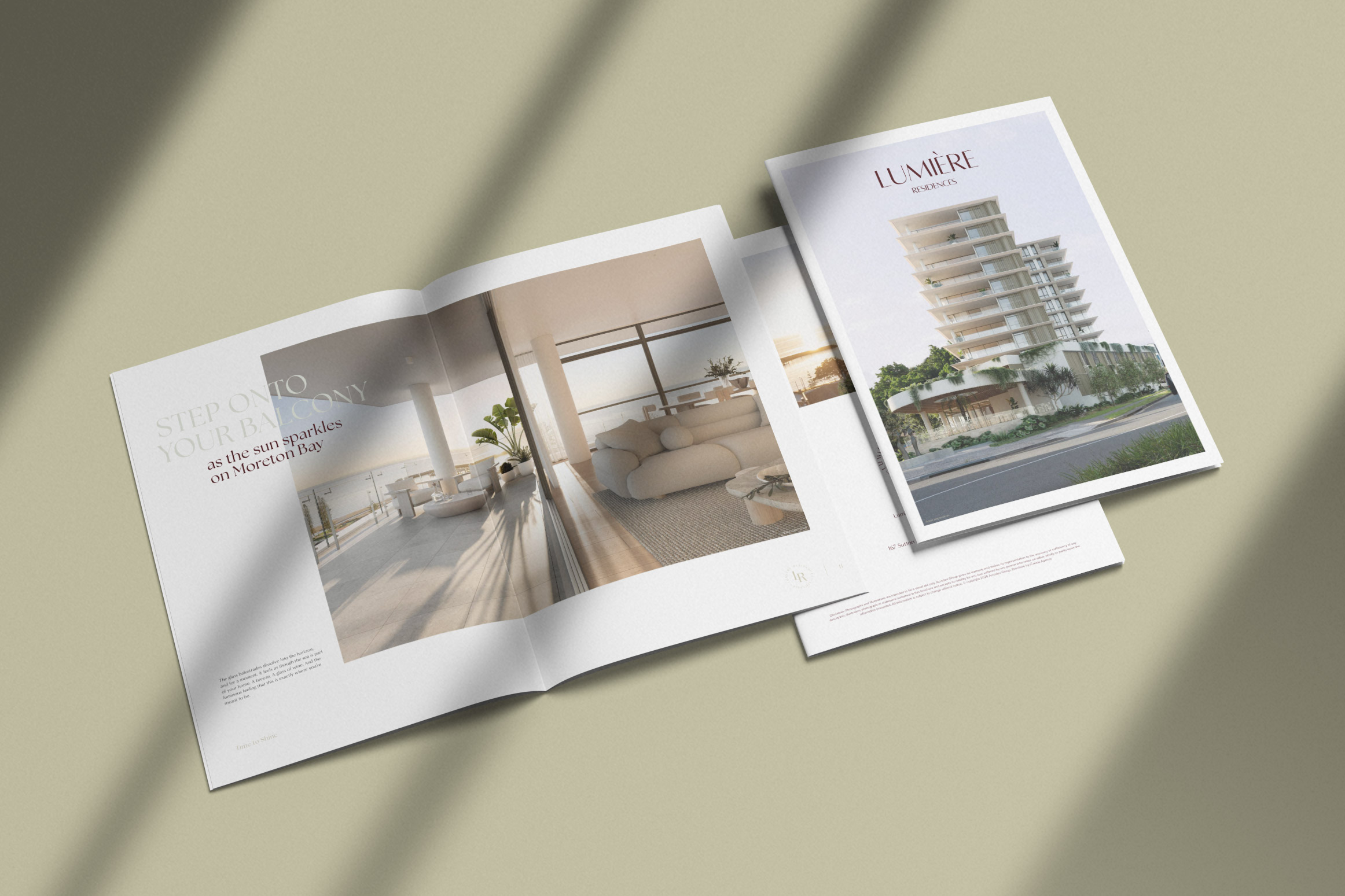
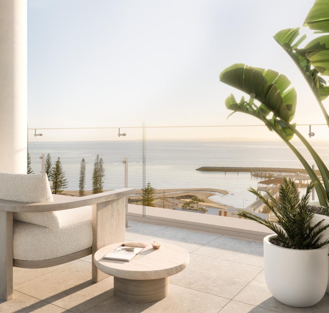
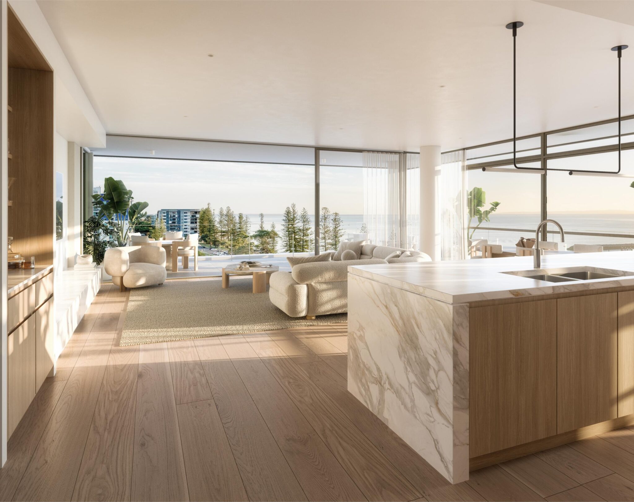
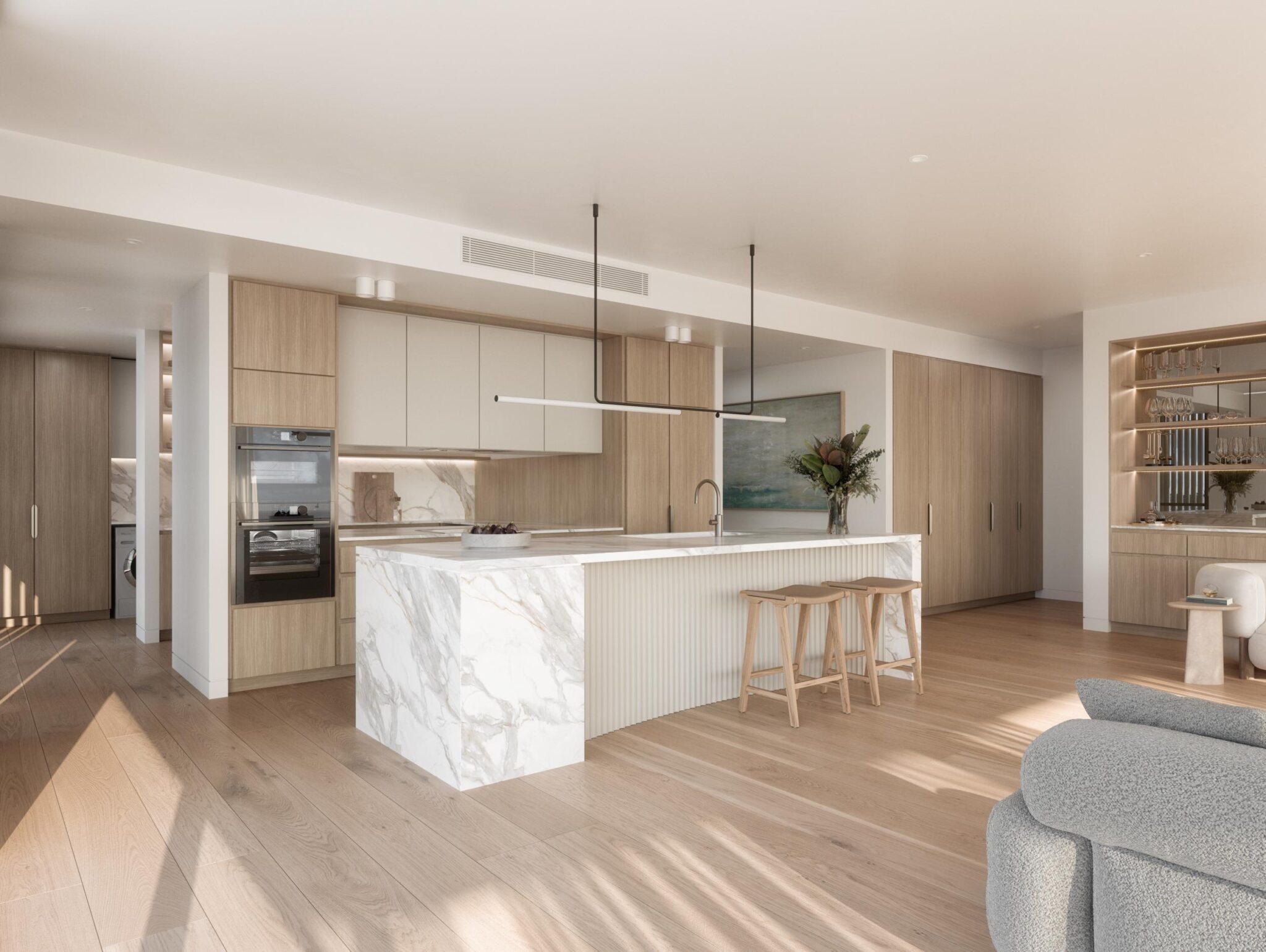
We crafted the Lumière brand in tandem with the brochure design, building the identity as the story took shape. The copy and visuals work hand in hand to evoke the experience of coastal luxury, pairing storytelling with architectural renders to help buyers imagine what life at Lumière will feel like.
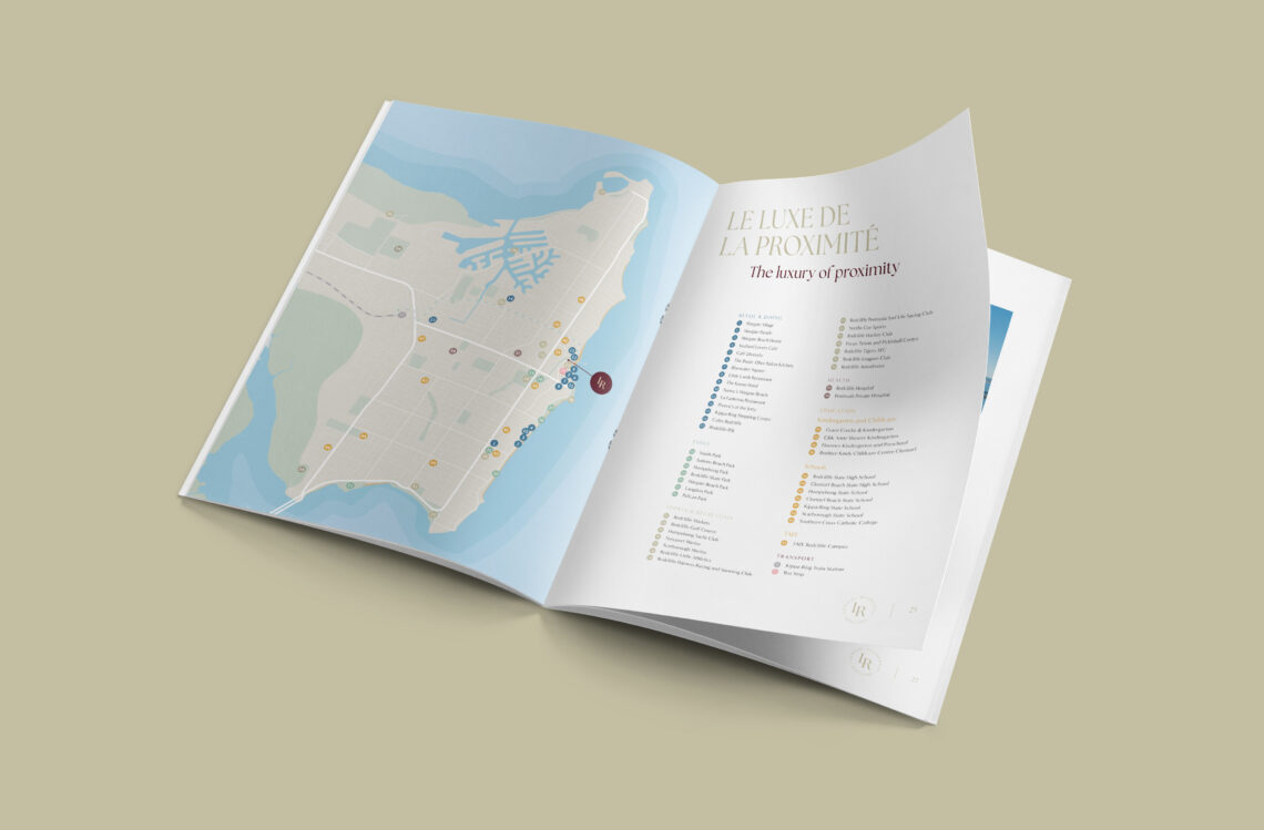
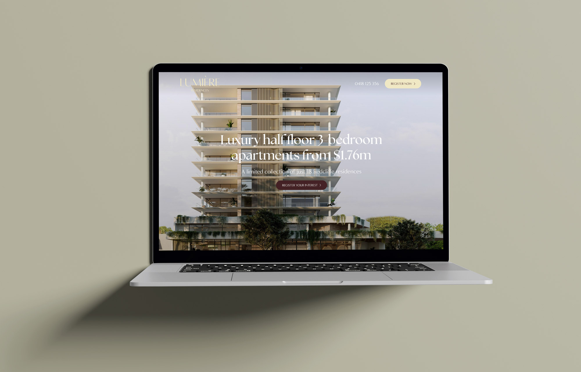
Following our proven copy framework, we built a landing page that guides potential buyers through a clear, story-led journey—showcasing how Lumière solves the search for effortless coastal living. It blends narrative and design, uniting the storytelling from the brochure with striking photography and elegant renderings to create a seamless brand experience.
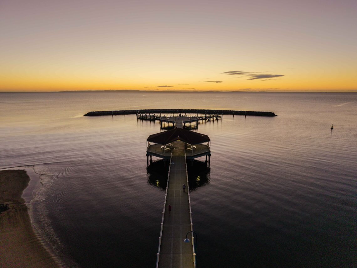
At the close, the Lumière logo sits over a video of a sunset dancing on the water — a visual metaphor for the brand itself. Lumière becomes the window to coastal luxury, reflecting the calm, golden light that defines life by the sea.
Designed to stop passers-by in their tracks, the Lumiere hoarding distilled the brand’s elegance into a single, powerful statement. With a direct call to action and integrated QR code, it not only built awareness but delivered measurable results. Proof that when design and strategy align, even a hoarding can sell the dream.
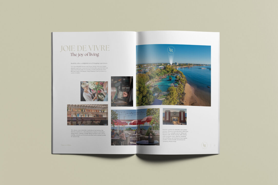
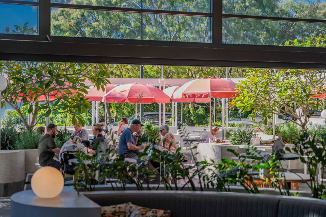
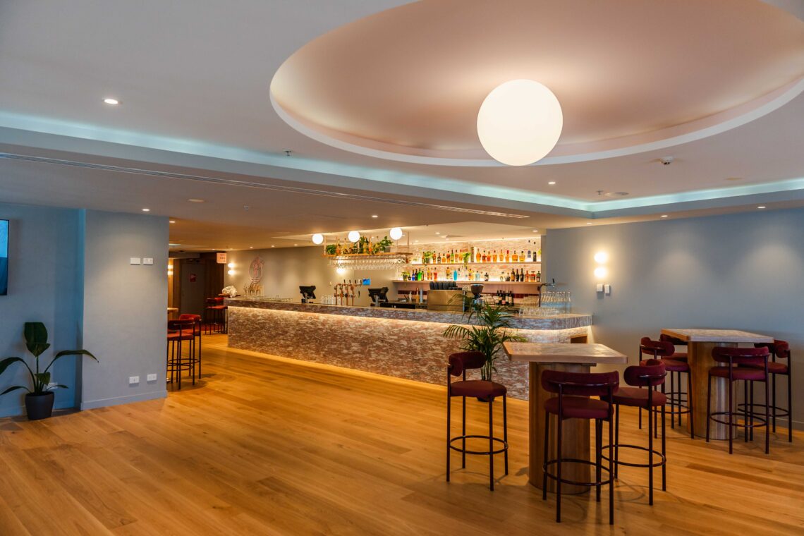
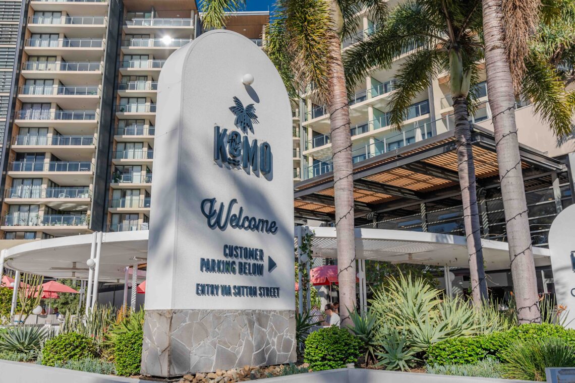
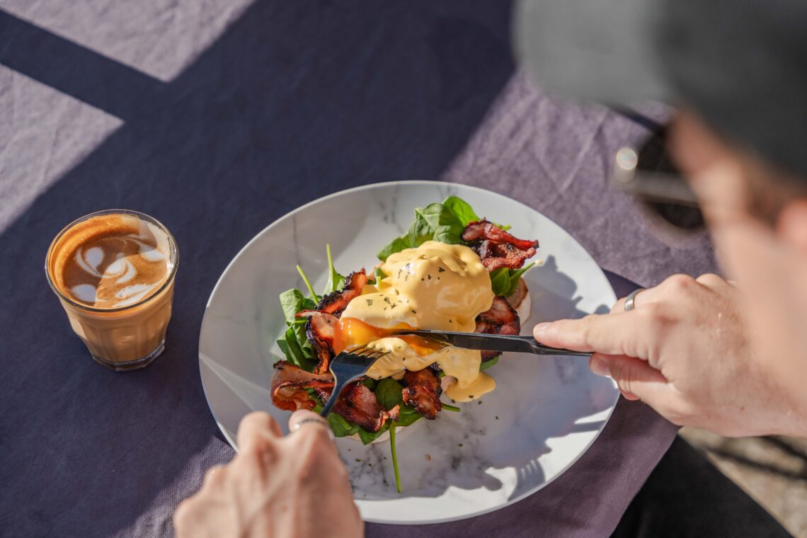
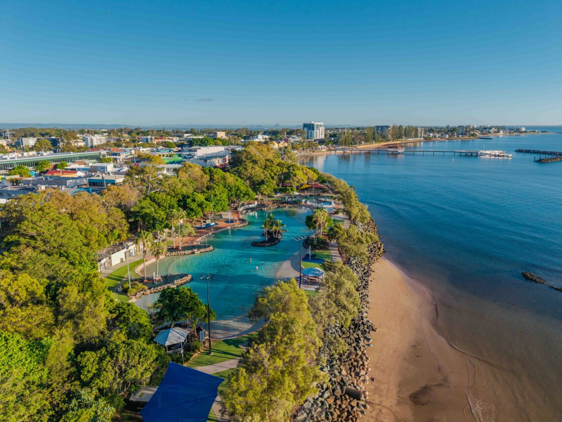
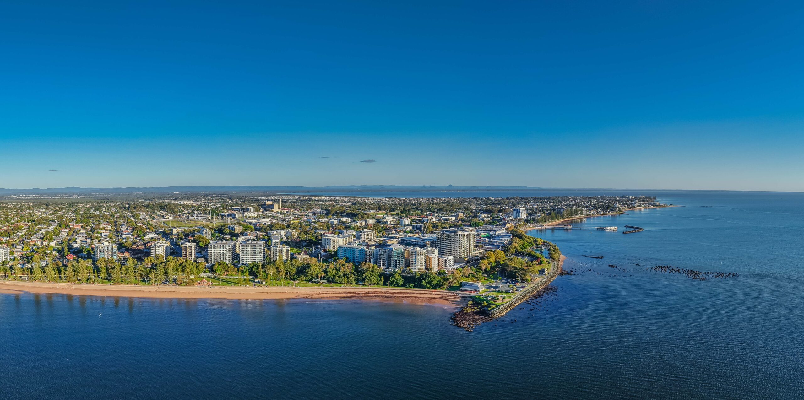
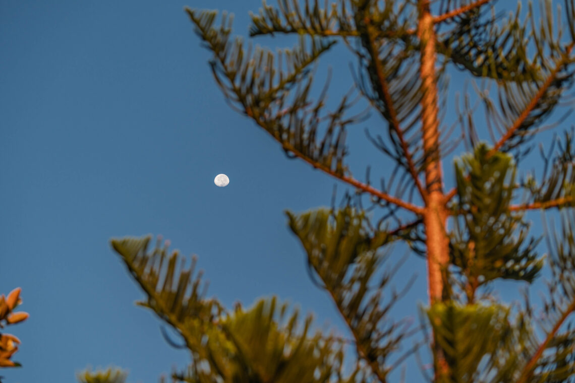
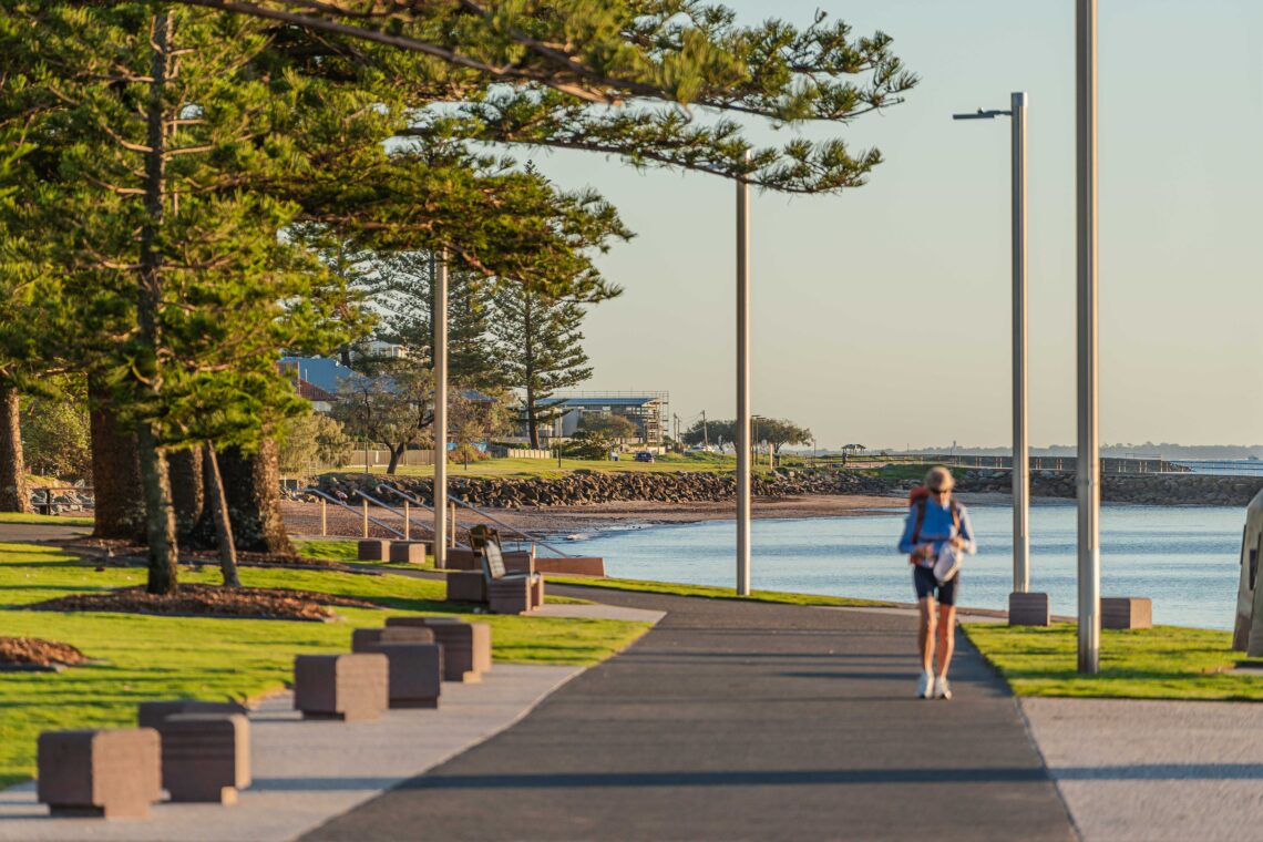
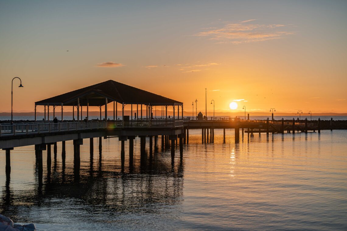
We partnered with Rolling Digital for a full-day shoot in Redcliffe, art-directed and planned by us. With no talent, we focused on capturing authentic local life through cafés, restaurants, boutiques, parks and the coastline. The result was a genuine portrayal of Redcliffe’s lifestyle.