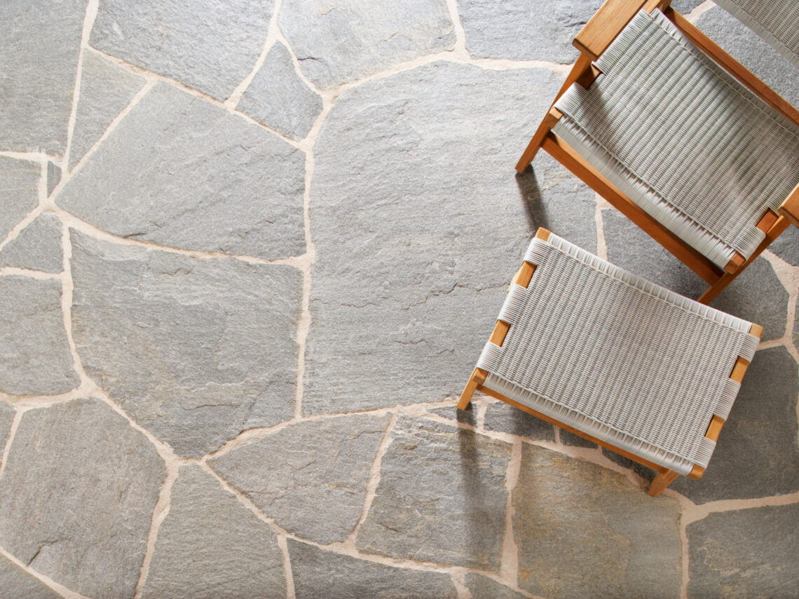
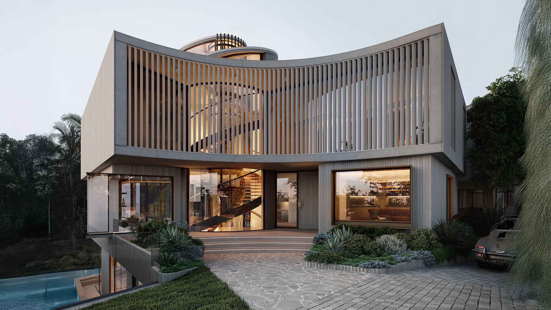
Stafford Co asked us to bring clarity, sophistication and distinction to these two ultra-luxe, architectural residences by Conrad Gargett in Hamilton. Our role was to develop a brand identity that captured the essence of these homes: equal in prestige, yet distinct in personality.
Challenge
With two homes on a single site, Stafford Co faced a unique problem of how to present the pair as distinct, individual residences while communicating their shared prestige and vision.
At the price point they were aiming for, the market was narrow, and the audience highly discerning. They needed a brand that stood apart from typical off-the-plan marketing.
Our challenge was to create an identity that conveyed true luxury, subtle, intelligent and emotionally resonant, while avoiding cliché.
Strategy and Approach
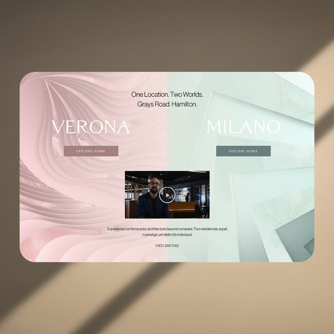
We began with a clear positioning statement: One location, two worlds.
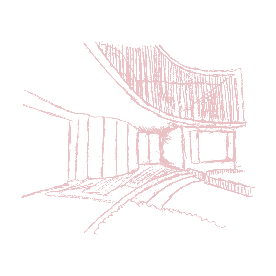
Our creative direction celebrated duality — the idea that two homes could express the same vision through contrasting design languages. Inspired by Italian artistry and heritage, we developed names, brand language and visual identity that reflected this interplay of difference and unity.
Every element of the brand was designed to capture the balance between timeless sophistication and contemporary edge, appealing to a high-net-worth audience who value design as much as exclusivity.
Final Experience
The result was a brand that embodied prestige at every touchpoint.
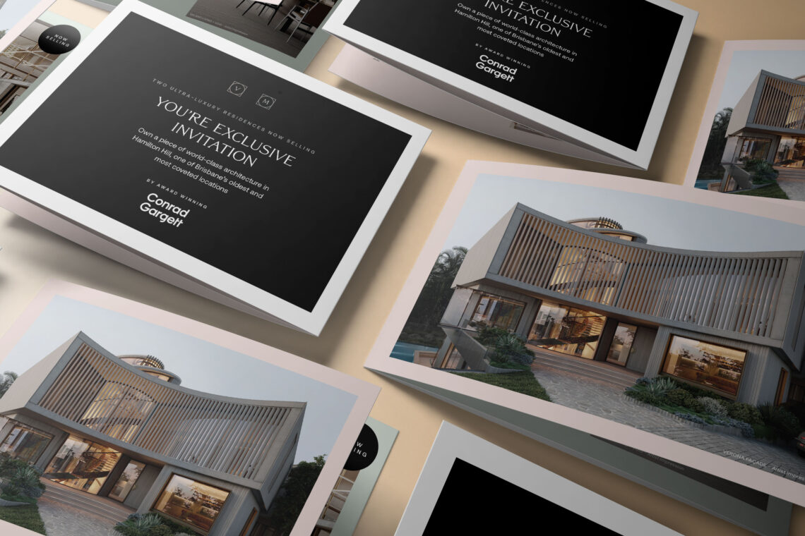
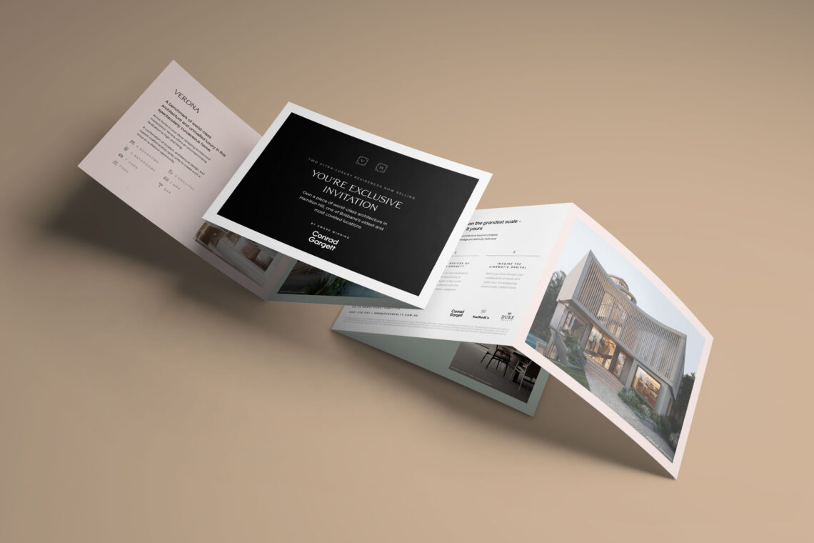
Case-bound brochures, hoarding and digital media extended the brand’s refined aesthetic, while the single landing page united both homes under one address, reinforcing the idea of one location, two worlds.
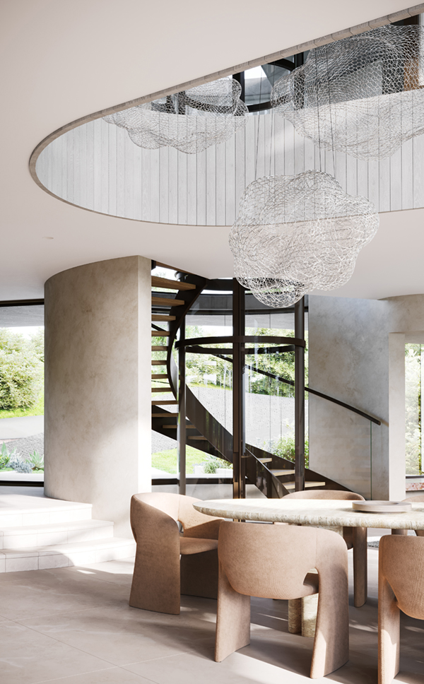
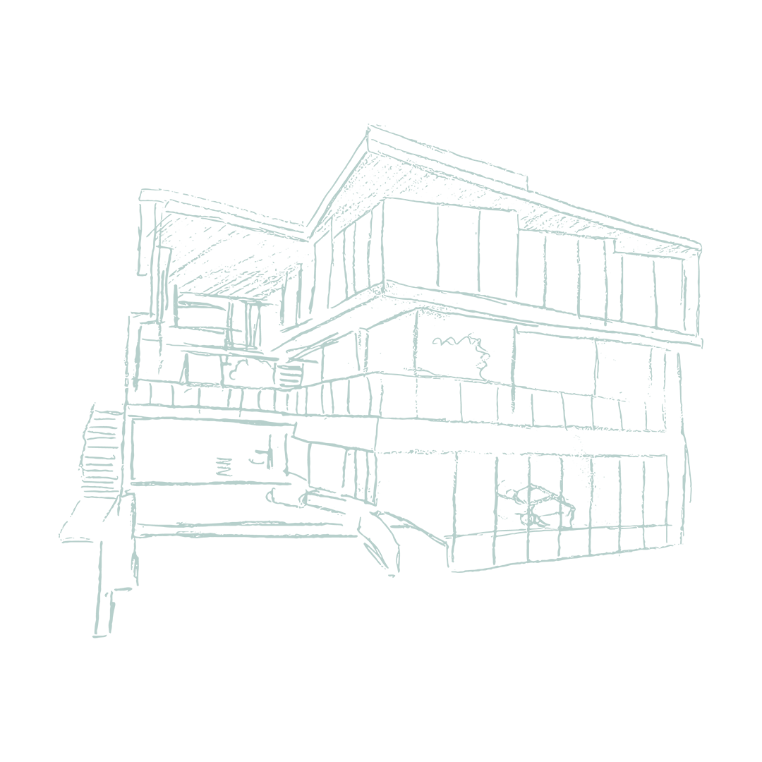
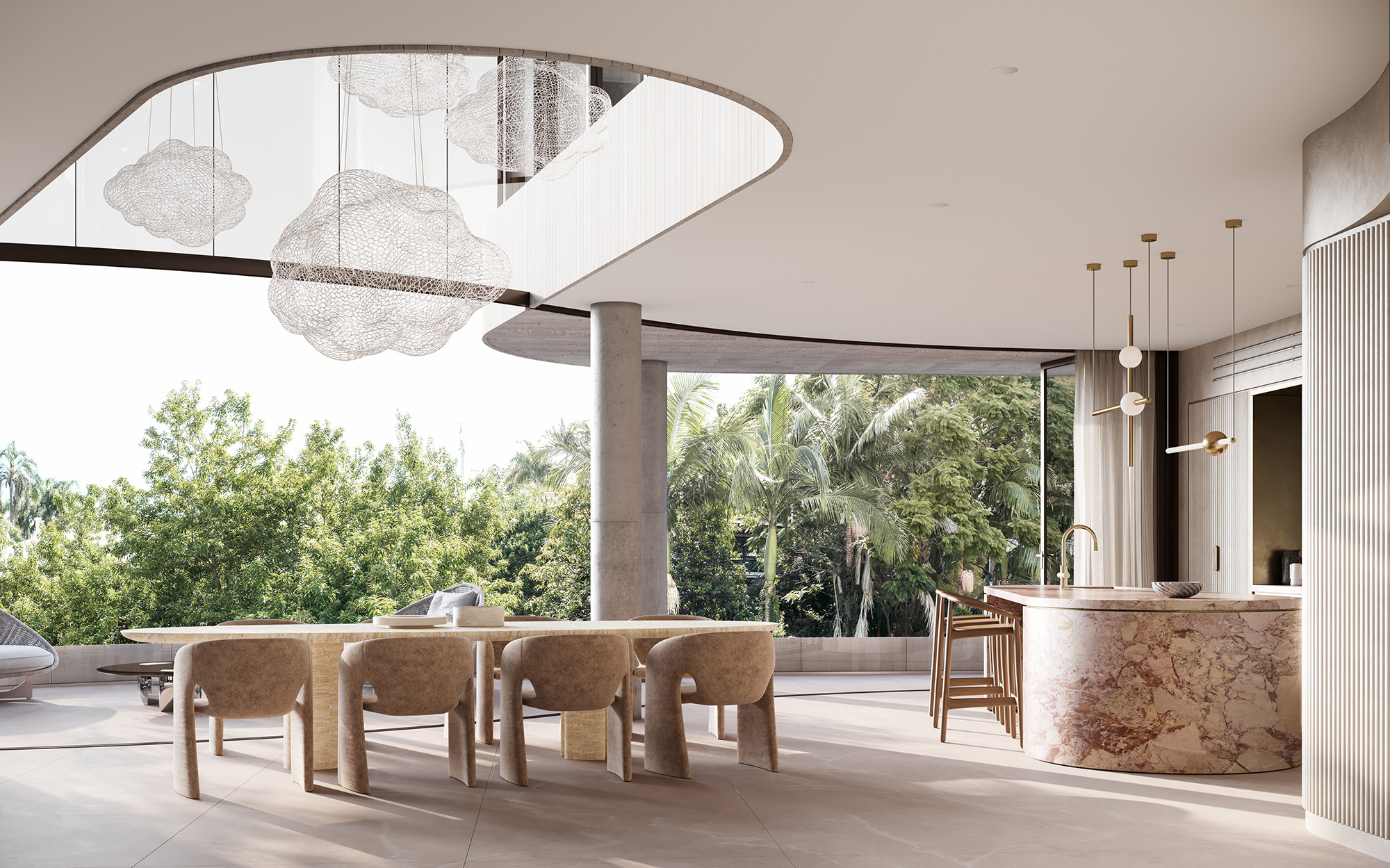
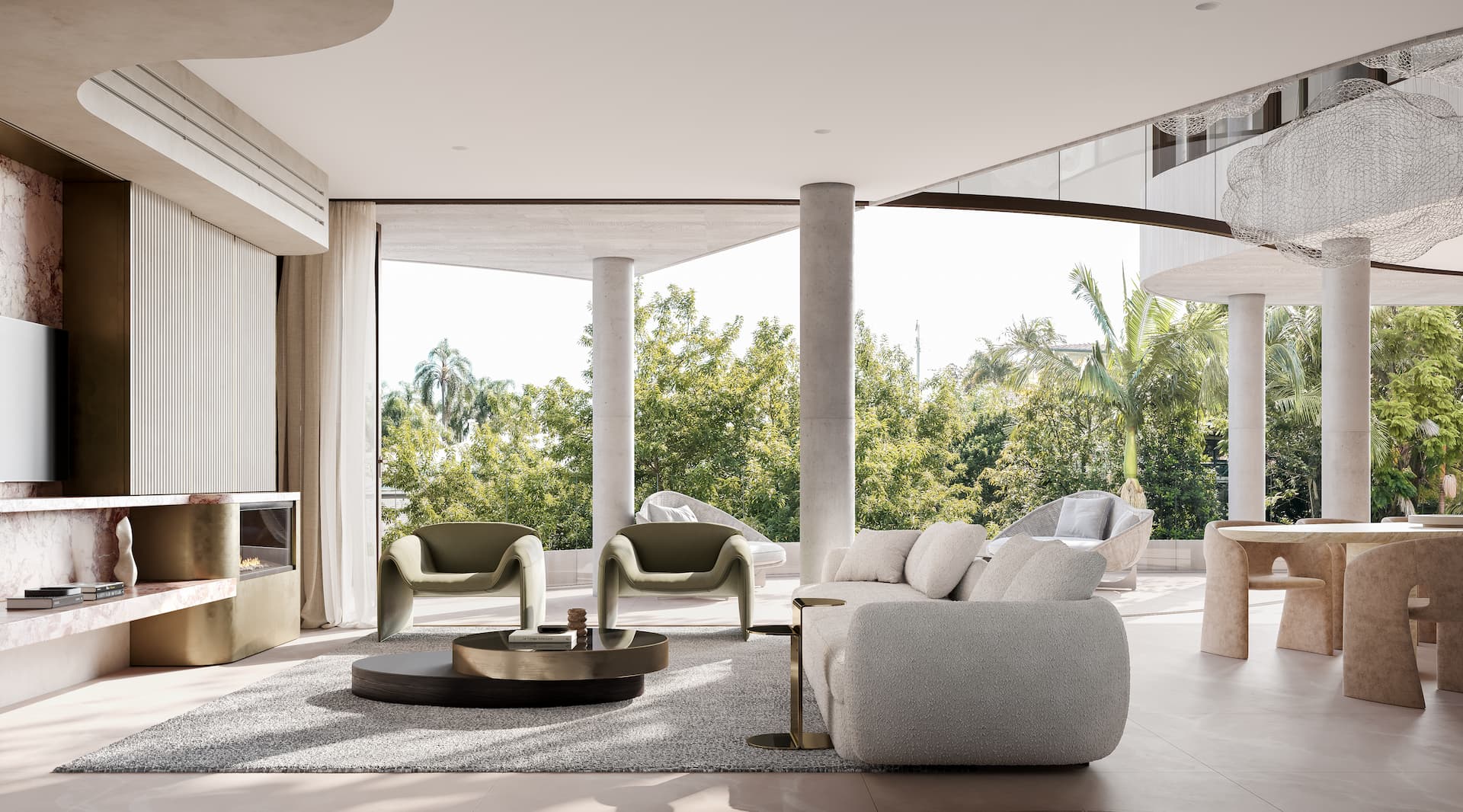
Verona and Milano are statements of architecture, craft and vision. The kind of project you don’t just see once, but return to again and again, discovering new detail and meaning with every look.
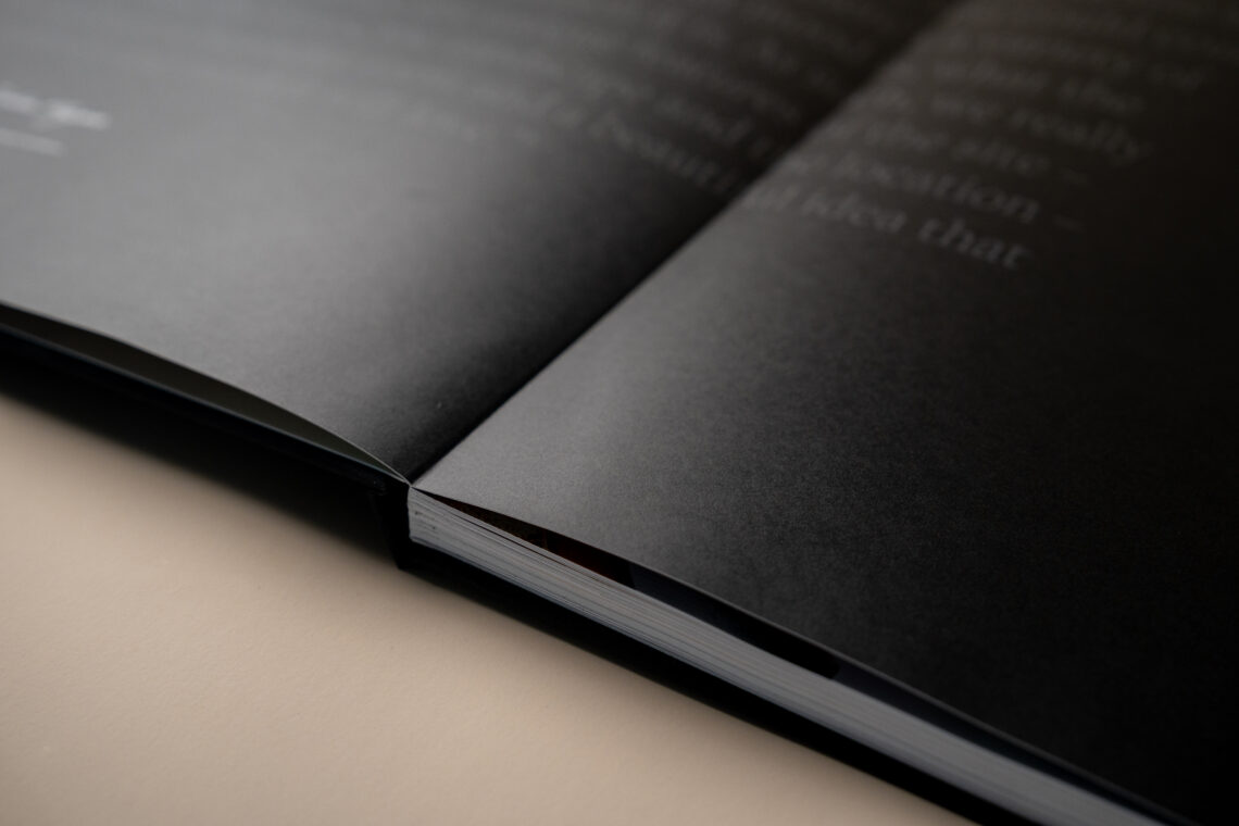
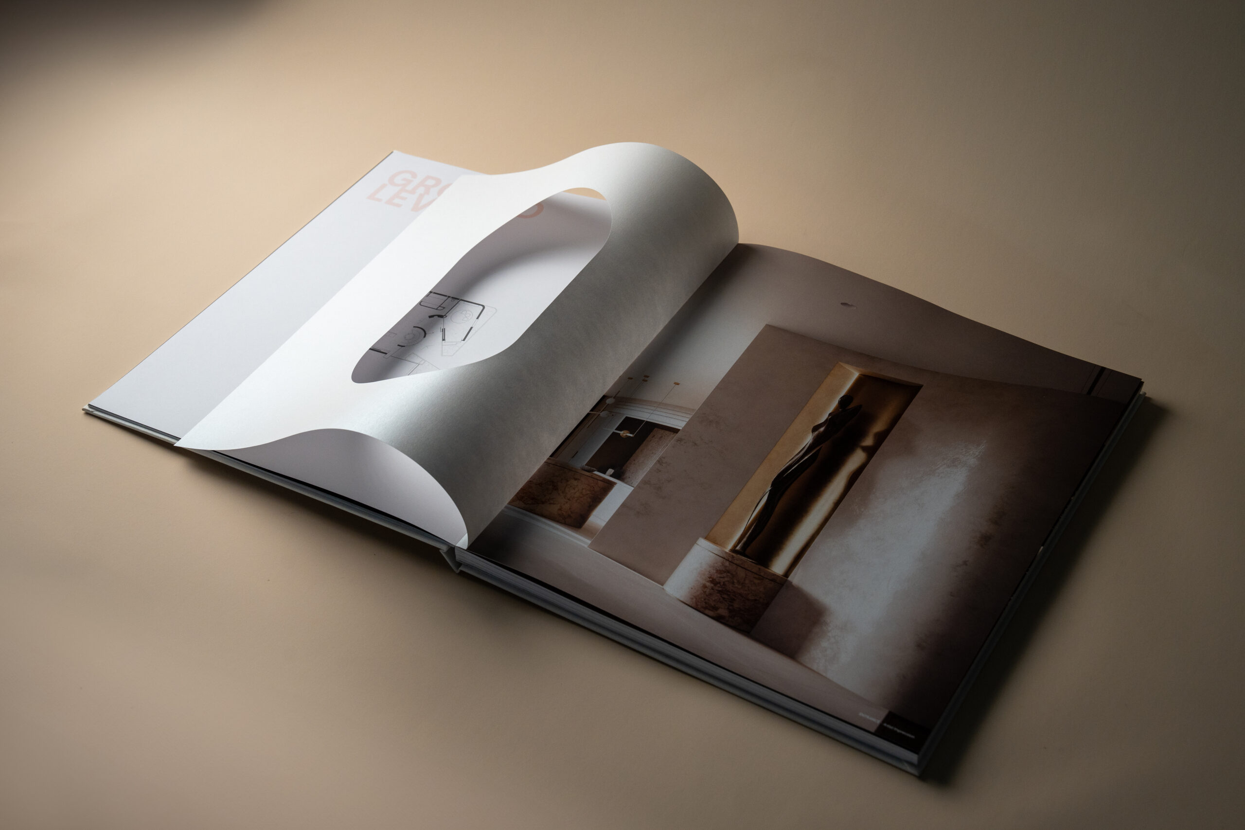
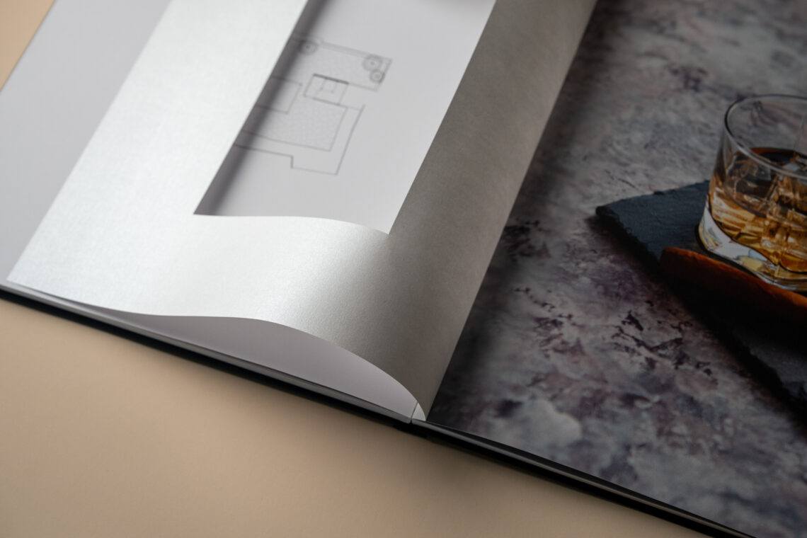
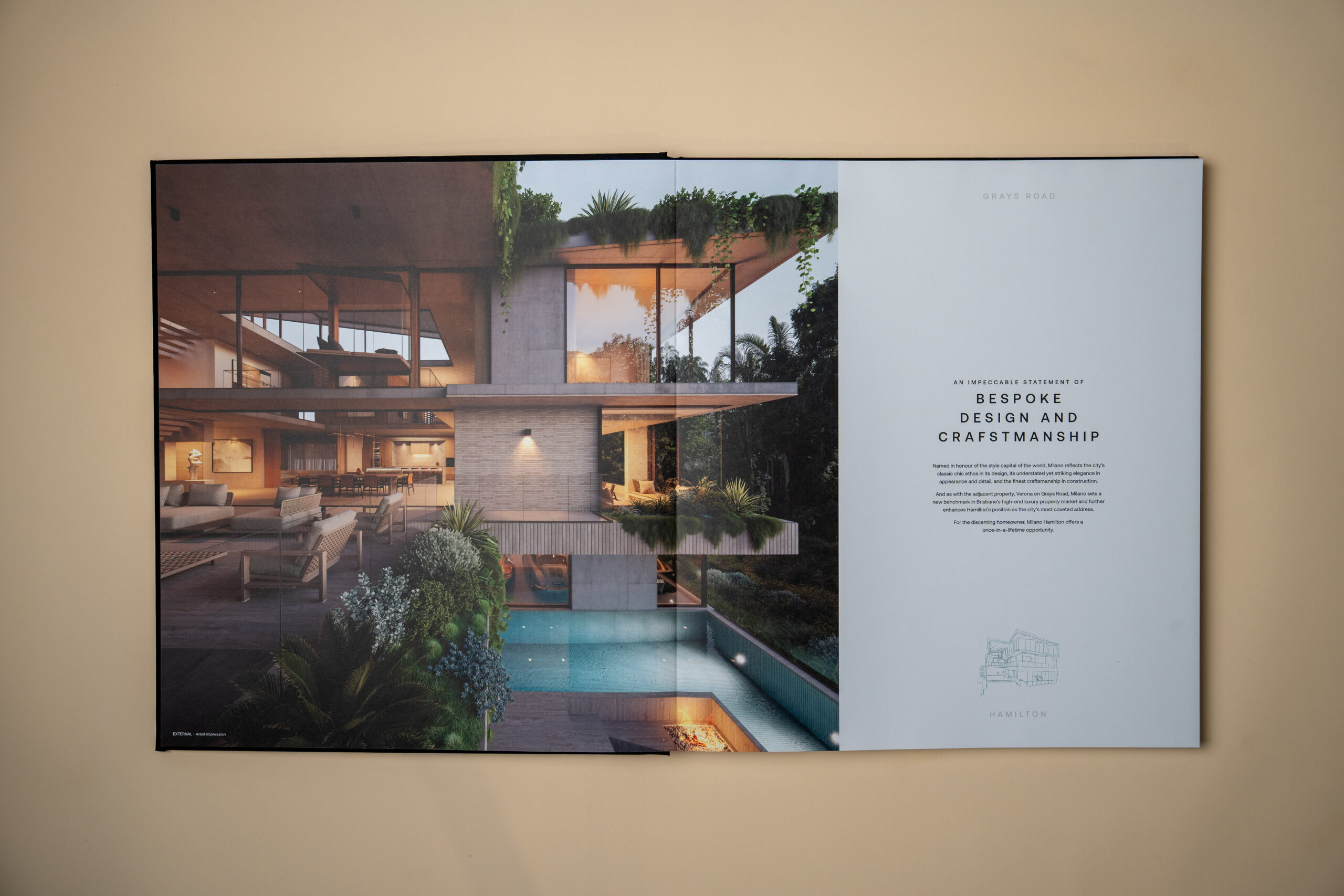
Crafted as collector pieces, the brochures are case-bound in book cloth with subtle embossing. Flat-lay binding allows the renders to sit uninterrupted, an intentional design choice to showcase every detail in full.
Minimal, refined wordmarks differentiate each home while sharing a cohesive typographic foundation.
Verona Residence
Each residence draws its name from Italy’s cultural icons. Verona, inspired by romance and heritage; Milano, by couture and craftsmanship. Together, they create a narrative of two worlds, one vision.
Milano Residence
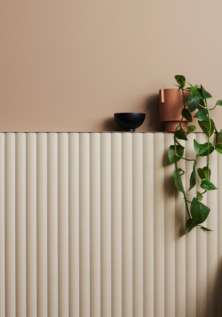
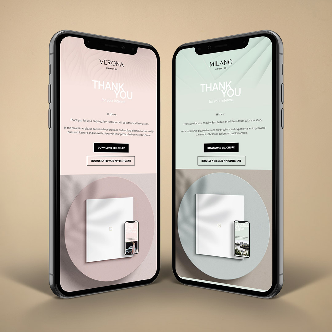
Soft pinks and warm neutrals for Verona. Muted greens and greys for Milano.
These palettes reflect the distinct marble tones of each home, capturing their individuality while sitting harmoniously together.
A single landing page connects both homes, mirroring the strategy of one location, two worlds. Users can explore each residence individually while understanding their shared story of architectural excellence.
‘In my mind, the concept [...] was simple. Create a home that would become a true Brisbane landmark property, showcasing everything that is great about the city, the river and the beautiful sub-tropical climate’.