There's a question we hear regularly from clients deep in a branding process: 'Does our logo communicate enough?'
But the better question is: what is your logo actually supposed to do? Because once you’re clear on that, the pressure lifts and creative possibilities open up.
A logo has one job
A logo’s job is identity. It needs to be distinct, appropriate to your field and consistent enough that, over time, people recognise it as yours. That’s it.
It’s not supposed to communicate the quality of your product, the warmth of your service, the professionalism of your team, the uniqueness of your experience, or the values behind your business. Those things are the job of your brand system (that’s your photography, copy, website, the way your team answers the phone and even packaging). The logo is the flag. Everything else is the country.
When you ask a logo to carry all of that weight, one of two things happens. Either it becomes so complex it doesn’t work, or the brief becomes so constrained that the creative output is bland. Neither serves the brand.
The Brand System
How the world's best brands actually work
The strongest brand identities in the world aren’t built on logos. They’re built on systems that are flexible by design.
Built decades of equity in a swoosh and a wordmark working together. Today, the swoosh works entirely alone. The word Nike itself rarely needs to appear. They got there by investing in every element independently until each one could carry the brand on its own.
Puts the crocodile on a shirt and the wordmark on a shopfront. Neither needs the other. In combination, they’re unmistakable. In isolation, they’re equally clear.
Uses the horse and carriage motif selectively and sparingly. The restraint is deliberate. Scarcity of the motif is part of what makes it feel premium. The wordmark does most of the work, and the brand’s warmth and craftsmanship are communicated through product photography, retail environments and the weight of the ribbon on a box.
No icon, no mark. Nothing beyond a typographic wordmark in a clean, considered font. And yet, Aesop is one of the most immediately recognisable premium brands in the world. The brand lives in the amber bottles, store design, staff knowledge and even smell.
Their brand device isn’t even a logo in the traditional sense. It’s a leather-woven texture that appears on bags, accessories and packaging. For Bottega Veneta, it’s all in the application. It arrives as a detail rather than a declaration, which makes it more surprising and more memorable.
The pattern across all of these brands is the same. The logo holds the name and the system builds the meaning.
The three strategic choices every brand faces
When we work on your visual identity, there are 3 directions available, each with its own strengths.
1. Motif and wordmark together
A graphic device (icon, illustration, symbol) used alongside the brand name. The two elements work together as a lock-up and can be used separately as equity builds. This is the most common approach and works well when the motif communicates something genuinely meaningful about the brand that the wordmark alone cannot.
2. Typographic logo with an application asset library
The Aesop and Bottega Veneta model. A clean wordmark, no icon, but a set of brand assets (illustrations, patterns, textures, photographic style) that live in application rather than in the logo. This approach tends to feel more sophisticated and premium because the brand’s personality arrives through touch, experience and detail. It also ages better. A well-chosen typeface rarely dates the way a graphic device can.
3. Typographic with application elements used freely
Similar to the above, but with the application assets used with more freedom across different touchpoints without a formalised asset library. The personality of the brand comes through in how the assets are deployed, not through a defined system. More appropriate for brands with strong creative direction and a willingness to evolve.
None of these is inherently better than the others. The right choice depends on your brand’s positioning, category, audience, and what the brand is actually trying to communicate.
What this means in practice
What surprises most people is that a typographic logo with strong application assets can communicate more about a brand than a complex logo mark, precisely because the two things arrive at different moments.
When someone lands on your website and sees a confident, clean wordmark, they receive one message: this is a serious, well-run business. Then they scroll and discover beautiful photography, warmth, detail and personality. That’s where the heart of your brand lands. And because it arrives separately, it lands harder.
If all of that was packed into the logo, neither message would be received clearly.
This is why photography is, for many brands, the primary vehicle for communicating premium quality. The logo announces you. The photography makes the case.
This applies especially in property
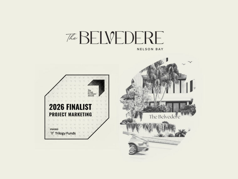
In property marketing, the challenge is more acute than almost any other industry. A brand is often launched before a single sod has been turned. The logo exists before there’s a building, before there’s photography, before there’s a sales suite or anything for a buyer to touch or feel. For months, sometimes years, the mark has to carry the entire brand promise on its own.
Developers who navigate this well don’t put more pressure on the logo. They plan the full brand system from day one. There’s a photography brief for when the building is complete, copy that tells the story of the place before it exists and a sales experience that makes the brand tangible. They treat the logo as the starting point, not the destination.
That thinking is what separates a property brand that has longevity from one that feels dated.
A question worth sitting with
If you’re working through a branding process and you find yourself asking whether your logo communicates enough, try asking instead: what is our logo’s actual job, and what does the rest of our brand system do?
If you can answer that clearly, you’re already thinking like a brand, not just a business with a logo.
iCreate Agency is a property marketing and brand strategy agency based in Brisbane. We help businesses build brands that work across every touchpoint, from identity to content to campaign. If you’re working through a brand project and want a fresh perspective, get in touch.