Your colour code was right. So why did the brochure come out wrong?
You’ve done everything properly. You’ve locked in your brand colours, handed over the exact Pantone code, and signed off on the design. Then the brochure comes back from print and the colour isn’t quite it. That sage green looks flatter. The tone’s shifted. Nobody changed the code. So what happened?
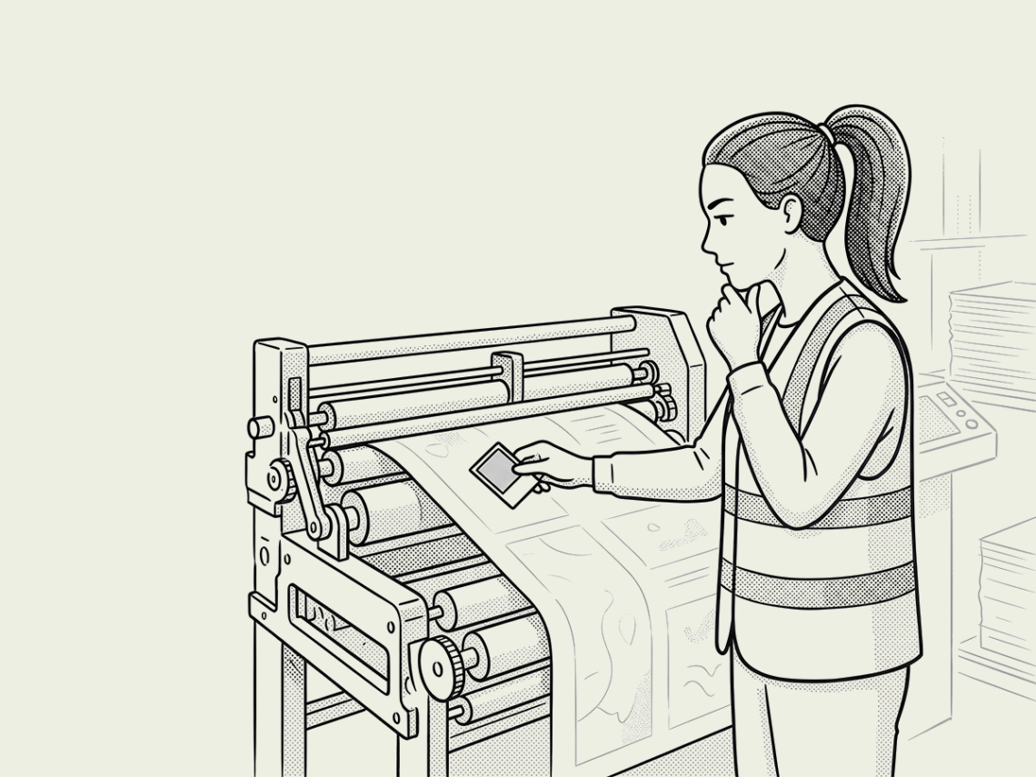
This is exactly the moment we found ourselves in recently with the brochure for Solais Residences Newstead. The colour code was correct, the design was signed off, and the print still came back different to what everyone had in mind. So we went to our print partner, Spot Productions, and stood over the press with a stack of sample sheets until the colour was right.
Here’s why we bothered, and why it matters to you if you’re the one putting a project in market.
Colour accuracy isn't just a
design nicety
For an off-the-plan buyer, a brochure is often the only piece of your project they get to actually hold. Everything else is a render and a promise. If the colour drifts, if that rich sage green reads dull and washed out, the perceived quality of your project drops in their hands, right when you need them feeling confident enough to enquire. And a brochure isn’t like a social ad you can pause and fix. Once it’s printed, it’s printed. There’s no second run, unless you’ve got money to burn.
Why did the colour
print incorrectly?
So back to the mystery. If the colour code was right, why did the result look wrong?
The short answer is that a Pantone code only tells you the ink. It doesn’t tell you what that ink looks like once it hits paper, and that depends heavily on the stock. The print finishes you choose make a difference. Coated paper has a fine clay or polymer coating that keeps ink sitting on the surface, so it reflects light cleanly and colours print bright and true. Uncoated paper doesn’t have that coating, so ink soaks slightly into the fibres and the surface scatters light rather than reflecting it, which mutes and softens the same colour. Add a matt or gloss finish on top and you’ve got a third variable again, since gloss bounces light straight back for punchy contrast while matt diffuses it for a flatter, more subdued look.
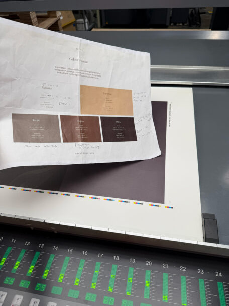
This is precisely why Pantone publishes separate coated and uncoated swatch books for the same colour library. The code is one thing. What it looks like printed is another, and that depends on the exact stock and finish you’ve chosen. And plenty of the finishes we use regularly, things like soft touch laminate or spot UV, don’t appear in any standard swatch book at all. There’s simply no page you can point to and say ‘that’s what this will look like.’ The only way to know for certain is to see it printed on your actual paper. So, colour code or not, we get on press before anything goes to a full run. We check the actual proof, on the actual stock, under the actual finish, side by side with what was meant to print. It’s a small extra step that catches a problem long before it reaches a buyer’s hands, and it’s why we work with print partners like Spot Productions, who care about getting colour right as much as we do.

What this means for your next print run
If you’re bringing a project to market, this is the kind of detail that’s easy to overlook until it costs you a reprint, or worse, a buyer’s confidence. It’s also exactly the kind of detail we build into every campaign we run, because a brochure that looks slightly off undoes a lot of good strategy. Let’s create marketing that works, print included.